
TIG Roundtable: The jersey edition
Our favorites!
A new NWHL season brought a crop of new jerseys to the league! For the first time, each team will have a home and away set. The newest team, the Toronto Six, also has a third jersey.
With that in mind, some of our staff gathered round the virtual roundtable to talk about their favorite new sweaters. They decided to break it into two conversations: their favorite individual jersey and favorite team set.
For a refresher on each jersey, click on the team name or scroll to the bottom for a gallery of the mock ups from each team!
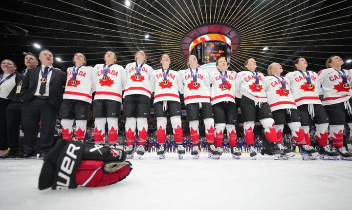
Toronto Six // Connecticut Whale // Boston Pride // Buffalo Beauts // Metropolitan Riveters // Minnesota Whitecaps
Favorite Individual Jersey
Anne Tokarski: My favorite individual jersey would have to be, hands down, the new Whitecaps home jersey. I thought when the Riveters released their new away uniform earlier in the day that that jersey would take the cake for me, but then Minnesota completely blew me out of the water with the landscape on the hem of the jersey. Wow. I can’t even articulate my thoughts, honestly, it’s just so clean and good. I think in hockey, players and teams don’t get as much of an opportunity to express themselves when it comes to uniforms, so this was a really cool way to pay homage to Minnesota’s “Land of 10,000 lakes” moniker and also just look incredibly sick at the same time.
Leighann Strollo: I have to agree with Anne that the Whitecaps white home jersey is just literal perfection. I’ve been a consistent fan of the Six’s jerseys since they dropped, and I honestly didn’t think anything would top the detail of their white jersey for me but one look at the Whitecap’s whites and I was sold. I’m easily going to drop far too much money to buy the whole roster in that jersey. It’s just so incredibly details and unique and I can’t wait to see it live.
Casey Bryant: The Riveters’ away blues take it for me. I give credit to the league for finally listening to what fans have been screaming for since they went away, which is to bring back the original layout with updated colors. I’m sure we’re all on board with the Whitecaps’ home whites too, so I’ll toss a shoutout to the Pride’s road yellows which I think are extremely clean.
Mike Murphy: The Minnesota Whitecaps’ new home jersey really stands out to me. It’s creative and bold without being too over the top. It also feels like a perfect fit for the Minnesota without being similar to any of the team’s previous jerseys. The colors are true to what the Whitecaps’ identity and the only way this jersey could feel any more Minnesota is if it was covered in 10,000 lakes. That in and of itself speaks to just how great this sweater is.
Jen Silber: Although I like the Riveters’ away jersey, particularly those rivets on the shoulders, I’m going with the majority on this one: The artwork on the Minnesota Whitecaps’ white home jersey is fresh and eye-catching without being distracting. (Or so I assume. We’ll know for sure when we see the team in action.)
Favorite Team Set
Anne Tokarski: My favorite team set is the Whale’s duo of uniforms. I think they look the most cohesive and like they truly belong together, which is in part due to the fact that the Whale’s color scheme is just so iconic. While all the uniforms do go together, the Whale’s match without being complete inverses of each other like we see with a lot of college hockey uniforms, and I think that’s so cool.
Leighann Strollo: It’s close for me between the Beauts and the Riveters but I think I’m going to go with Buffalo for this one. The color blue that the Beauts use is just so different for a hockey jersey and I never get tired of seeing it. I think the way it’s accented well on the black jerseys just works so well and complements the black and white in a way that simply no other hockey jersey is doing right now. Honorable mention to the Riveters though because that is a seriously good set as well.
Casey Bryant: Metro’s set takes it under the condition that they please lose the corny military font they used for their numbers on their home whites last season. Please. If they do, it’s the Riveters’ color scheme with two meaningful, unique designs that narrowly edge out Minnesota for me.
Mike Murphy: For me, it’s either the Riveters or the Six. I love the Rivs’ new road jerseys and how it echoes the team’s jersey from the 2015-16 season. Both the home and road sweaters look sharp and clean, but you can say the same of all three of the Six’s jerseys. So... I guess that means they win? Nah, I’m going with the Riveters. Truth be told, each team has at least one jersey that I think is really damn good. You really can’t go wrong.
Jen Silber: I think I have to go with the Beauts’ set for this one. Here’s the thing — I really like it when all of a team’s various jersey designs feel similar to each other. Toronto’s black and red jerseys do a nice job of that, but the sleeve stripes on the white jersey then stand out in a weird way, to me. Buffalo’s two designs use the same starred stripe on the sleeve in nearly the same place, as well as showing off the big crowned-bison logo without a lot of extra frills.
Which reminds me of an interesting thing I noticed about the designs this season. Each team seems to be showing off their logo, in a very large way, without setting it on a contrasting patch or background panel. I think this is easiest to see on the Whale’s road jersey, with all that green on top of a green sweater. Some teams have had big breastplate-looking crests in past seasons, but now they all have a more uniform look for their away designs. And I wonder if that was done so that the visuals would be clearer when people watch games on smaller screens via Twitch (and that, of course, called to mind the story about the center line of a hockey rink needing to be patterned because of black-and-white televisions — the more things change, the more they stay the same).
Comments ()