
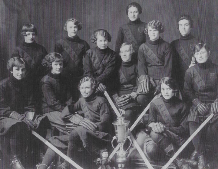
A fashion “expert” reviews the new NWHL jerseys
Fall fashion week is back, and we’ve got some mixed opinions on the two new jerseys.
It’s Fall Fashion Week for the NWHL. This year we have two fresh jerseys that will hit the ice and the runways in October, from the Metropolitan Riveters and Connecticut Whale. The other three teams appear to be maintaining their jerseys from last season.
As the Ice Garden’s resident fashion expert (qualification: I worked retail in a clothing store in high school and one time they let me dress a mannequin), I’m reviewing these new styles based on the highest standards of fashion. Here’s everything you need to know about the hippest sweaters of the season.
Metropolitan Riveters
NEWS: The @Riveters are unveiling a new sweater design for the NWHL's 5th season.
— NWHL (@NWHL) September 27, 2019
Get yours today at https://t.co/axSSd3MbFQ!
📰: https://t.co/gf9cY6QmBV pic.twitter.com/UoHtKIlz79
I’ll start with what I do like, which is the switch back to the primarily white jersey of the team’s first season. I know this is controversial, because white jerseys are objectively worse than all others.
That’s why my approval of the white sweater is conditional. I think that the shift makes sense only if we also see a return to the red shorts of that season. Between those two colors and the navy sleeves, the three colors in the design should be very well-balanced, as seen below in the Riveter’s debut getup.
all four og #nwhl teams jerseys through all four seasons pic.twitter.com/en31kODi3m
— Michelle Jay (@michelle_jay3) September 27, 2019
What little we can see of the numbering is intriguing. It’s unique and goes well with the Riveters’ general wartime-manufacturing theme. The stripes on the sleeve also reference this history, since they’re indicative of the stripes on the wings of the airplanes that women in factories on the home front manufactured.
This nod to history and the team’s name is an interesting layer that we don’t often see in hockey jerseys. I won’t deny that it’s very cool, but I do have some opinions on the execution— namely, the image that it invokes.
That’s right. The stripes look like the reflective stripes on a firefighter’s uniform.
Firefighters and hockey players are both valuable parts of a community, but serve arguable different functions. What if the similarity in uniforms provokes confusion? Imagine the chaos of a local firefighter accidentally being ushered onto the ice during a line change. There would be chaos. Presumably, a mix-up in the other direction would be even more disastrous.
My proposed solution is simple: lower all three stripes to the forearm and thin them out. This could also involve differentiating their sizes slightly— for example, widening the middle stripe on each sleeve. That way, the team can maintain the symbolism of the three-stripe detail without any unfortunate pyrotechnic mix-ups.
All in all, I rate this sweater a 4/10. With the red shorts there will be a nice color balance, but the sleeves leave a lot to be desired.
Related
Riveters unveil new jersey for 2019-20 season
Connecticut Whale
NEWS: The @CTWhale_NWHL are going back to green this season.
— NWHL (@NWHL) September 30, 2019
"Green just feels right.” - All-Star defender @SDoyle_6
📰: https://t.co/ex99suRW1u pic.twitter.com/VP20HHz2St
This look synthesizes some of my favorite elements from previous seasons: the green-dominated background from 2016-17, the blue shoulder yokes from the past two seasons, and my favorite element, the wave along the bottom stripe. They’ve also retained the shoulder whales, which are a key selling point for me. As we know, whales are the correct sea animal for hockey teams to create alliances with.
Of course, no jersey is perfect, so I have two main suggestions for future Whale sweaters.
One, make the whale of the logo even bigger. It’s a fairly unusual mascot animal and the logo does an excellent job keeping its shape simple but recognizable, so lean into it and let it take up more of that valuable front space.
Second, darken the jersey slightly. I do like that the shade on this new sweater is darker than that of the team’s logo, but there’s something I love about how clean a darker jersey looks. I’d love to see the Whale move to something a little similar to the Minnesota Wild’s current home jersey, although I do understand that it may make more sense to remain lighter to lean into the ocean theme.
My overall grade is a 7/10. There are a lot of unique elements that make this a fun one.
Related
Whale officially release new jerseys

Comments ()