
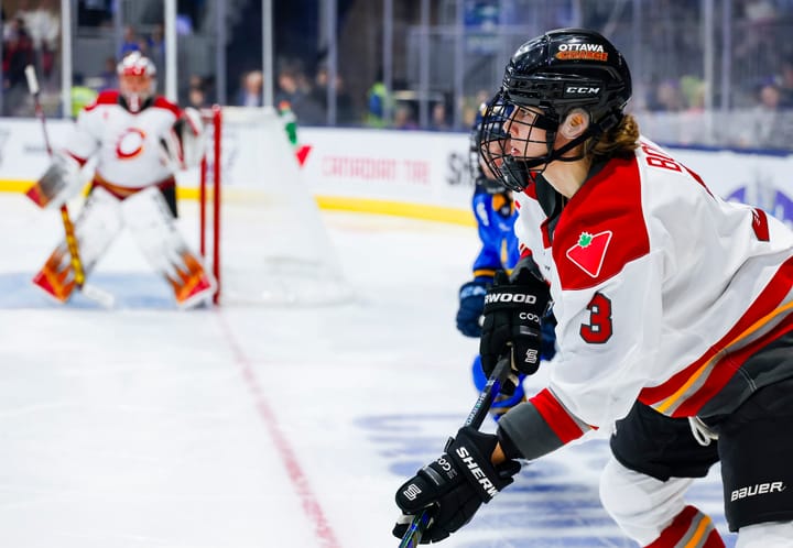
Favorite All-Time NWHL jerseys
The NWHL has played host to some of the most fashionable jerseys in professional hockey, so we’re taking a look at the five best jerseys in NWHL history
With the release of two new jerseys for the fifth NWHL season, the topic of hockey threads has been a hot button issue in women’s hockey the past couple of weeks. In celebration of the NWHL’s fifth season, we’re taking a look at the five best uniforms in NWHL history.
#1: Metropolitan Riveters, Season One
The Riveters’ inaugural jerseys are widely considered to be one of the cleanest uniforms in professional women’s hockey. The combination of the all-white jersey with the navy shoulder stripe, red collar, and bold navy numbers is both sharp and easy-to-read, which is one of the most important aspects of a uniform for spectators. When you throw in the navy rivet pattern on the sides of the red shorts, the result is the kind of cohesive we uniform junkies love to see.
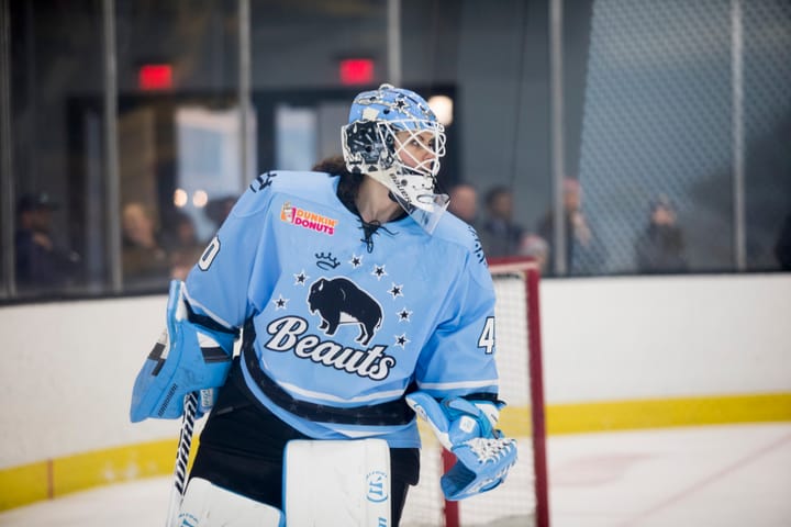
#2: Buffalo Beauts, Season Two
The Beauts’ season two uniforms were a massive upgrade from their all-gray season one jerseys, and instituted the trend of “Beauts blue” that we all know and cherish. Once again, the contrast of a dark shoulder stripe with a lighter jersey body makes these uniforms especially clean, and the thin, multi-colored stripes on the arms, hem, and shorts look particularly good. When you add the hint of light gray to the bold black, blue, and white, the result is a more mellowed-out jersey that still stuns.
Related
A fashion “expert” reviews the new NWHL jerseys
Riveters unveil new jersey for 2019-20 season
Whale officially release new jerseys
#3: Connecticut Whale, Seasons Three/Four
The Whale have experimented with a lot of different colors over the course of their tenure in the NWHL, but their foray into white jerseys has undoubtedly served them the best. The burst of color in their primary logo make the white backdrop the best option, though the Whale have swapped out the white for green this upcoming season. Nevertheless, the season three/four jerseys are defined by the royal blue shoulder stripe and the distinctive wave pattern on the hem of the jersey, the arms, and the shorts, tying in with the theme of their team name and also breathing a breath of fresh air into the typical striped pattern.
#4: Boston Pride, Season Two
There is nothing sharper than an all-white jersey, and that trend persists in the naming of our second favorite jersey: the Boston Pride’s season two uniforms. The combination of the old scratch-mark logo with the yellow outline makes this jersey even more stunning, though the white holographic “Boston” word mark demotes the jersey to a #4 ranking. The stripes on the arms, hem, and shorts all work together to form a cohesive uniform that is both eye-catching and aesthetically pleasing.
#5: Boston Pride, Season Three
Though white jerseys are a resounding favorite across the NWHL, homage must be paid to the Boston Pride’s black jerseys for their incredible distinction both on and off the ice. The Pride brought out a new logo for season three, and it meshes wonderfully with the black backdrop of the jersey in a way many of the newer jerseys do not. The yellow and white stripes on the hem of the jersey also ensure that the black jersey and black shorts don’t melt together too much.
We’ve put our picks together — but what are yours? Leave your opinion in the comments below or reply to us on Twitter with your favorite jerseys in NWHL history.
Comments ()