
TIG Roundtable: PWHL Jersey Reveal
The TIG staff shares our thoughts on the inaugural PWHL jerseys.
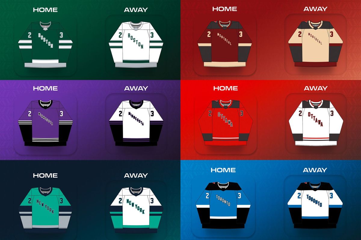
The PWHL unveiled their inaugural season jerseys on November 14th, and we asked some of our TIG creators to share their thoughts in our latest roundtable.
“Nothing Fancy, but They Get the Job Of Beginning to Establish an Identity Done”
Lydia Murray: While not the most exciting things going, I’m fine with these jerseys. They are about what I was expecting. Nothing fancy, but they get the job of beginning to establish an identity done. Sure, there’s no logo or team name, but it shows that the league is intent on making the market the central part of the team’s identity, which isn’t necessarily a bad thing. While I understand why some are disappointed all the jerseys are the same design, I like it and think it will bring a sense of cohesiveness to the league in its inaugural season. That being said, each team having a distinct, bold color was also a good choice, because they’ll still be easily identifiable even without logos or differently-patterned jerseys.
🟢⚪️⚫️ pic.twitter.com/DzE6MwitYV
— PWHL Boston (@PWHL_Boston) November 14, 2023
I’m a big fan of Boston’s green. I was a little skeptical of it when they first teased it during the draft because of the long history of black-and-gold Boston hockey, but after seeing it on the jersey, I’m sold. But I also really like any sort of dark red as a jersey color, so the Montréal and Ottawa jerseys stick out too. Montreal's retro feel is perfect for such a historic hockey city, and the stark contrasts of Ottawa's away jersey really make them pop.
Nothing going on here, just showing off the new fits 🤜🤛 pic.twitter.com/mlcPJtg4a0
— PWHL Ottawa (@PWHL_Ottawa) November 14, 2023
As for my least favorite, I'll have to go with New York for now since the teal is rather bright. I expected them the teal to be a little greener like it is in the mock-ups. However, it has potential so I’ll wait to make my final judgment on them until I see them on the ice.
“I Don’t See an Identity Yet”
Meredith Foster: If a picture is worth a thousand words, then my feelings about the inaugural PWHL jerseys can all be surmised with this GIF.

I don't see identity yet. I don't see anything to make this league interesting or unique. I see a lack of imagination and a lack of the solid individual marketing plans that are critical for making an immediate impact.
Respect the drip. pic.twitter.com/q739TAimbl
— PWHL New York (@PWHL_NewYork) November 14, 2023
That said, the New York teal has my attention. I personally favor teals leaning more towards a peacock than a cyan, but I respect a bold choice and I'm curious to see how this looks on the ice. I also like Montréal's retro feel in their colors.
“All Things Considered, They Establish Identity”
Mike Murphy: All things considered, the PWHL’s first-season jerseys are fine. I had low expectations because we weren’t getting logos and team names, which set the stage for something simple and generic. And that is what we have- some old-school, collegiate-feeling jerseys that do the job of establishing team colors and that’s about it. To be honest, I was most skeptical of Boston’s color being green after years of gold/yellow with the Blades and Pride. I love this rich green that Boston has. Paired with the right logo, it could be really special. The same can be said for Minnesota’s purple and New York’s teal.
Our players are lookin' pretty darn good in the new threads 🤩 pic.twitter.com/4boxQzgpgd
— PWHL Minnesota (@PWHL_Minnesota) November 14, 2023
I see a lot of folks absolutely torching the jerseys on my timeline and I get it. They are bland. They are generic. They don’t exactly scream “the pro women’s hockey league we have all been waiting for.” But, all things considered, they establish identity. I honestly didn’t expect much more than that.
“It Could’ve Been so Much Better”
Angelica Rodriguez: So... they certainly are jerseys. As far as color schemes go, I've seen worse. I love the retro feel of Montréal's colors, and I think we need to add more teal and purple to sports jerseys in general (a la New York-not-New York and Minnesota).
On aime nos nouvelles couleurs 🤌🏼
— PWHL Montréal (@PWHL_Montreal) November 14, 2023
We like our new colours 🤌🏼 pic.twitter.com/fqNIsNfm5b
The big issue for me is that for all the fanfare and pomp, all of this feels incredibly rushed and half-baked, like much of what the PWHL has come up with in the months following the initial buyout of the PHF. If you weren't certain as to what your team names and branding would look like a month and a half before the season is purported to start, why not keep what you had with the league you bought? The branding was never going to be perfect, but it could have been so much better and more thought-out than it feels right now... but then again, when one of your ops folks is calling things like branding "mundane details," I guess you get what you put out in that regard.
“[They] Can Build a Good Basis to Build on Going Forward”
Maya Smith: While it would be fantastic to have team names and logos on the inaugural season jerseys, I don't hate that they decided to go in this direction. The font doesn't look that great on some of them, but they are generally nice color schemes and can build a good basis to build on going forward.
Our inaugural jersey designs will have us skating in style this season. 🔥 pic.twitter.com/fzIhkPrZR9
— PWHL_Toronto (@PWHL_Toronto) November 14, 2023
I really like Montréal's color scheme; it feels vintage but also really cool and I'd definitely wear them to a hockey game. I like that they have more than one color on their jerseys as it makes them much more interesting. My least favorite I think is Minnesota. The color feels really muted and boring, especially compared to the mockups. I don't really like the Toronto ones either, but I really like the color on their other merch.
Our TIG creators’ opinions vary as much as the public’s, but that’s a good thing. Varied opinions create better conversations. But, we can all agree that we’re excited training camps are finally open and that we're ready for the puck to drop in January!
Comments ()