
NWHL unveils All-Star jerseys
The league’s top players will meet in Nashville Feb. 10 at Bridgestone Arena
The NWHL officially revealed their look for the 2019 All-Star Game in Nashville.
Drum roll please 🥁... presenting the 2019 #NWHLAllStar jerseys! 😱
— NWHL (@NWHL) December 12, 2018
Pre-order yours!: https://t.co/YpKqO0mZjC
📝 https://t.co/KHjmGp0qYS pic.twitter.com/bxKXxPunZQ
The league will be rolling with a purple and gold color scheme with an overarching guitar theme. Team Stecklein has a quasi-paisley watermark covering the base with the primary All-Star logo on the chest, while Team Szabados has a partial watermark adorning the shoulders and a secondary crest unseen before today.
Related
NWHL announces 2019 All-Star rosters
What works
There’s a lot to like with these jerseys. The two logos for the All-Star Game are very Nashville, incorporating the nods to country music that also permeate the look of the NHL’s Nashville Predators. Team Stecklein’s sleeves and Team Szabados’ crest feature six stripes, representing the six-string guitar. In case that was too subtle, Team Stecklein’s crest is literally a guitar silhouette.
For comparison’s sake, the Predators have similar striping on their numbers, and piano keys lining their inner collar.
These jerseys are very contemporary. In terms of style, the NBA is most prolifically fashionable league in North America, and these were designed with similar forward-thinking ideas.
First, M Style Marketing really likes their watermarks. They are the same company that added the blue-wave design to the shoulder of the Minnesota Whitecaps’ new jerseys this season. But watermarks have slowly been seeping into the pro sports landscape, like in the Houston Rockets’ new city edition jerseys. The Golden State Warriors have made a tradition out of adding intricate little designs to their center crest in recent years as well.
It adds a new dimension, a subtle textural layer to the base of a jersey. I’m also glad that, while it covers the purple base of Team Stecklein, that idea wasn’t forced on the clean white base of Team Szabados. The watermark is instead limited to the shoulder and the inside of the secondary crest.
The accent detailing is also superb. One of the most common complaints with the Metropolitan Riveters’ current treads is that they are too “basic,” especially when compared to their design from the first season. Translation: There’s no collar or belt.
That’s fixed here. The collars are made a bit wider so the colors are more prevalent, the sleeves and belts have matching stripe designs, plus the stripes and watermark seem to extend to the gloves. If that is true, it would be the first time (to my knowledge, anyway) that a hockey team added special designs to their gloves beyond simple color-filling. Points for creativity.
Related
NWHL 2019 All-Star All-Snub Team
What could use work
The fact that the fonts don’t match between the two jerseys is a bit odd. Rarely, if ever, do All-Star games use different fonts on contrasting jerseys. Usually, the designs are simple inverses of each other. Team Szabados features a font not previously used in promotional material for this All-Star game, and actually looks a bit like the font used by the Los Angeles Kings.
Ultimately, where these jerseys fall just a bit short is in the color scheme itself. They are bright and colorful, as All-Star jerseys frankly should be, but something just doesn’t feel right about them.
It seems a bit too New Orleans-y.
Seriously, purple and gold is far more synonymous to me with Mardi Gras, LSU, and the New Orleans Jazz than it is with Nashville. Even the font used for Team Stecklein is eerily similar to the font used for the New Orleans Pelicans.
I can’t be the only one who sees this, right?
If these wanted to be more of a match for Nashville and Tennessee in general, the purple would have been replaced with navy blue. The Predators, Memphis Grizzlies, and Tennessee Titans all incorporate navy into their uniforms. Navy is more of a unifying color for the state, one would think, considering it is on both the Nashville city and Tennessee state flags.
That said, a navy base for Team Stecklein would have been significantly less fun. All-Star jerseys are supposed to go hard in the design department. Considering the neon atrocities the NHL has put out in recent years and the gradient design from last year’s NWHL All-Star game, I’m not the only one in the room who thinks so either.
Let’s see them in action
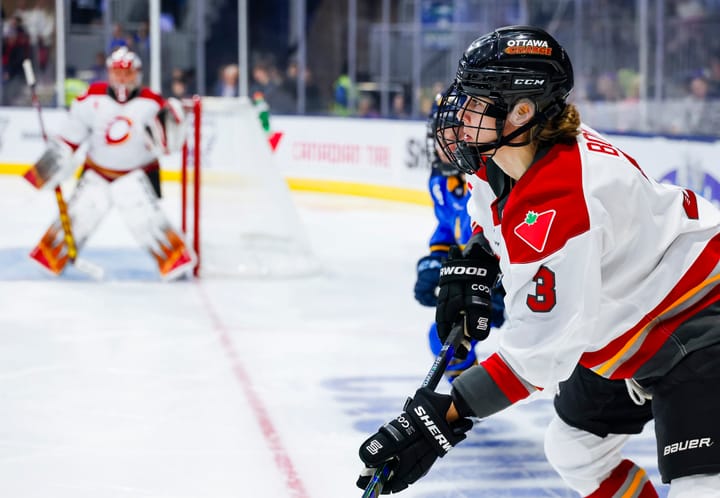
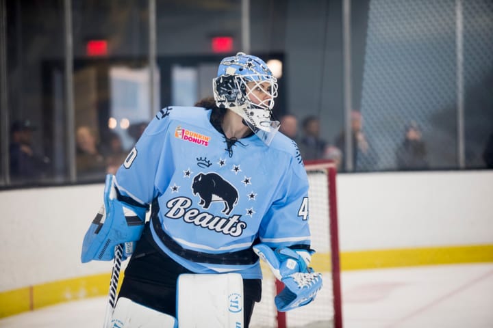
Overall, these are strong. There’s quite a lot of thought and effort put into these, which is admirable. The NWHL has been producing some sleek and unique new looks this season, from Boston to Buffalo to Minnesota, and these are no exception.
I’ll give them an 8 out of 10. What about you? Let us know in the comments!
Comments ()