
Team USA and Team Canada unveiled their Olympic jerseys and they're...something
So the 2018 Olympic jerseys for Pyeongchang are going to take some unpacking.
The sun is shining, the sky is blue, and oh god there are 100 days left until Pyeongchang and now Team Canada and USA have officially revealed their hockey jerseys.
Now before I get sucked into this, let's all remember that the main reason, Olympics after Olympics, the national team sweaters look — well — the way they do. It's in part due to the IOC’s ruling regarding federation logos not being allowed on Olympic jerseys.
Of course, this wasn’t always the case, with the IOC granting pardons to Hockey Canada in particular as well as the Brazilian and Argentinian men's soccer teams up until 2008 and 2010, respectively, when for the first time in history the iconic Hockey Canada logo didn’t appear front and center on the gold medal-winning team's jerseys.
But enough about the past. The Olympics always brings about jerseys that largely divide countries... until you see them worn with a gold medal around the player's necks and suddenly… BEST JERSEYS EVER.
TEAM USA
Red, White and New! 🇺🇸 @usahockey unveils their #WinterGames jerseys! Want to see? 👀 https://t.co/47Fndp4Kt1 pic.twitter.com/5ufPeoS0EI
— U.S. Olympic Team (@TeamUSA) November 1, 2017
I don't...hate...the Team USA jerseys. I just don't understand them (and I miss the throwback look).
Team USA, in my opinion, has always been the country that has the easiest time doing an off-brand look, mainly because the Team USA jersey has never heavily featured their logo in the same way that Hockey Canada has built an icon around theirs. With that in mind, I'm inclined to say — these are Bad.
It's not that I hate them, just that they look more like they belong to that of the snowboarders and are missing everything classic I usually appreciate about the Team USA jerseys. Even the USA wordmark looks weird and futuristic and, frankly, like they're trying too hard to be something ‘new’ and ‘hip’. And don't get me started on the tiny red wrist cuffs.
I for one do not understand why we have decided to become a downhill snowboarding crew with jerseys that look worse than that of the variety of unsanctioned USA vs CAN tours that exist around the globe. ANYWAYS.
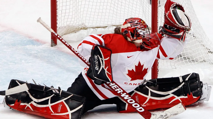
CANADA
It's here! #TeamCanada's hockey teams will be wearing this jersey in #PyeongChang2018. 🇨🇦🏒 pic.twitter.com/EfmUacQnYP
— Team Canada (@TeamCanada) November 1, 2017
Look, I'm not saying that Hockey Canada looked at the success of Team North America and said to themselves "WE can be ‘EDGY’ and ‘HIP ’too" but... okay maybe that's exactly what I’m saying (but more on that in a moment). Team Canada gets a get out of jail free card based on the fact that their logo is such a massive part of their branding.
However, that being said, they have still fallen victim to the same sword that Team USA did, which is this SLEEVE PATTERN. Whereas Team USA's sleeve made them look like they were suiting up to go to the skate park, Team Canadas make them look like some angsty kids who don't need parental supervision. I'm not sure even seeing MPP wearing these could convince me that this isn’t my local youth team. And again with the font choice for CANADA. Who is choosing these fonts and how do I get their phone number.
Lastly, the logo. Hockey Canada has doubled down pretty hard on the gold in recent years, with slogans such as ‘With Glowing Hearts” as well as the Giant Gold Maple Leaf T-shirt adorned by all of the last years World Championship silver-medal winning teams. And while I don't hate it, it's a stark change from the gold piping, imagery and general hype that we have become used to. I’m not saying that they should deck their teams head to toe in uniforms made of that shiny gold fabric that the Vegas Golden Knights use on their armbands, I'm just saying that maybe the Olympics isn’t the time to be sending your athlete's subliminal messages that its time to downgrade to silver.
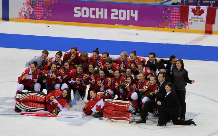
Either way, come February whichever team has the gold medal around their necks probably won't give a hoot what jersey they are wearing (or maybe Finland will shock the hockey world and Team USA and Canada will truly be able to put these in the very back of their closet and never think about them again).
Comments ()