
PWHL Reveals Official Logo
The PWHL's logo is officially here.
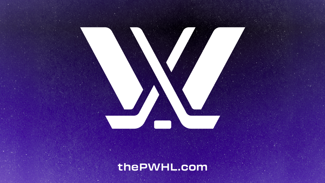
The PWHL revealed their official logo Tuesday morning.
Bold. Powerful. Undeniable.
— PWHL (@thepwhlofficial) October 24, 2023
Introducing our logo.
📰 https://t.co/Xdi9tJPUJC pic.twitter.com/ZRcd49JnXk
In an press release, Advisory Board member Stan Kasten shared the creative process behind the logo: “The element was chosen to illustrate a new beginning in women’s hockey, in the same way a face-off takes place at the beginning of every game.”
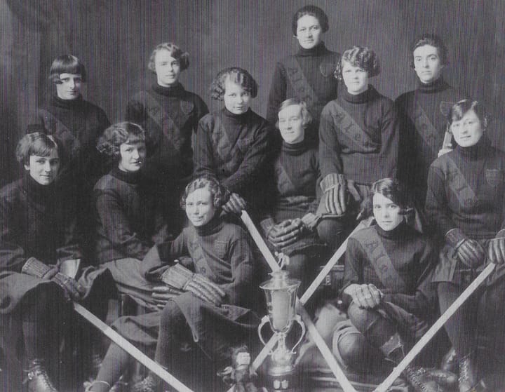
The new logo was slowly teased on social media for the last few days by some familiar names. Boston’s Hilary Knight, Minnesota’s Kendall Coyne Schofield, Montréal’s Laura Stacey, New York’s Abby Roque, Ottawa’s Brianne Jenner, and Toronto’s Blayre Turnbull all took part in sharing pieces to complete the puzzle.
🧐 @thepwhlofficial pic.twitter.com/DZ97iHcuLj
— Abby Roque (@abby_roque) October 22, 2023
The Makeup
- Younts Design, a design firm out of Baltimore, was hired to design the league’s logo.
- The “W” is the focal point of the design to place an emphasis on the athletes.
- The crossed hockey sticks represent a new beginning in women’s hockey history, the same way a face-off starts off a game.
- The purple represents the power and ambition that reflects the league's formation.
- The six pieces of the logo represent the first six teams in PWHL history, as well as the six players on the ice.
Comments ()