
Jersey Review: PWHL Seattle and Vancouver
What do our writers think about the newest PWHL teams' debut uniforms?
On October 21, the newest PWHL franchises, Seattle and Vancouver, debuted their jerseys ahead of the 2025-26 season. Reminiscent of the PWHL season one uniforms, both jersey sets feature the city name in diagonal text across the chest. The colors and design elements vary between Seattle and Vancouver, but according to the league press release, both palettes are “inspired by each city’s natural surroundings.”
According to the press release, both teams will have names and logos before the start of the regular season on November 21, though these logos will not appear on the jerseys until the 2026-27 season.
As TIG’s resident jersey aficionado, I (LJ) knew I had to review this release. To help me out, I’ve asked our Vancouver and Seattle beat writers, Maya and Silvia, to offer their thoughts.
PWHL Vancouver
The Jerseys
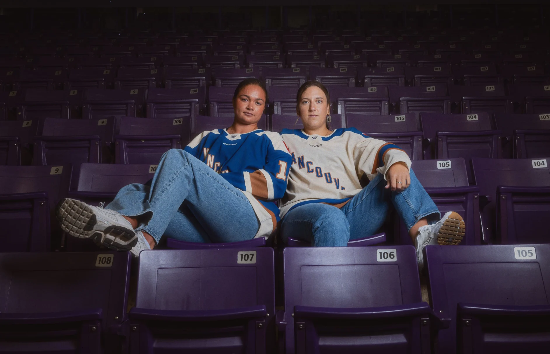
The colors for PWHL Vancouver are described as “Pacific blue and cream,” with “earthy bronze” accents. The home jersey is a blue base, with the city name and player numbers in cream with a bronze outline. There is a squared cream shoulder yoke, as well as a thin bronze and thick cream stripe along the waist. On the arms, there are two thin cream stripes surrounding a thick bronze band, although the stripes don’t go all the way around, as on all Bauer PWHL jerseys.
The away jerseys are nearly a one-to-one color swap of the home set, with cream and blue switching positions for the base, text color, and shoulder yoke. The arm stripes are now two thin bronze stripes and a thick blue band, while the waist stripes are a thin blue stripe above a bronze hem.
Looking out over our city in our new threads 😮💨 pic.twitter.com/h9IZCTUeLX
— PWHL Vancouver (@PWHL__Vancouver) October 21, 2025
Our Thoughts
LJ Bachenheimer: I’m obsessed with the colors. The blue and bronze look so nice together, since they play on blue and orange as complementary colors. I also love that both Vancouver and Seattle went with cream instead of just plain white. The overall look is very classic, but the jewel and metallic tones give it that modern touch, so the whole design is very effective. My one complaint is that “Vancouver” is just a little too long to fit comfortably on the torso as diagonal text, much like Minnesota’s Year One jerseys.
Maya Smith: Cream is THE colour. I don’t want to hear a single bad thing about these jerseys. I’m obsessed with them.
In reality, I can see the disappointment among fans that there was no team name or logo announced, and that the teams will not have a brand identity on their jerseys until next year. Whether it was done this way because of manufacturing issues and being unable to get the logos on the jerseys in time, or if it was done to match the season one jerseys for the original six teams (and bring in a little more money from selling two jerseys), I think they did a fantastic job of making these season one jerseys look as great as possible.
They also feel quite modern and stylish to me. Part of this is the styling of the photo shoot, but I like the idea that I could look cute in this jersey.
Silvia Leija Rosas: I love these. I love the royal blue. I love the bronze. I can already see someone reselling these Year One jerseys in ten years as “vintage.” I almost don’t want there to be a name or logo because of how great these look now.
PWHL Seattle
The Jerseys
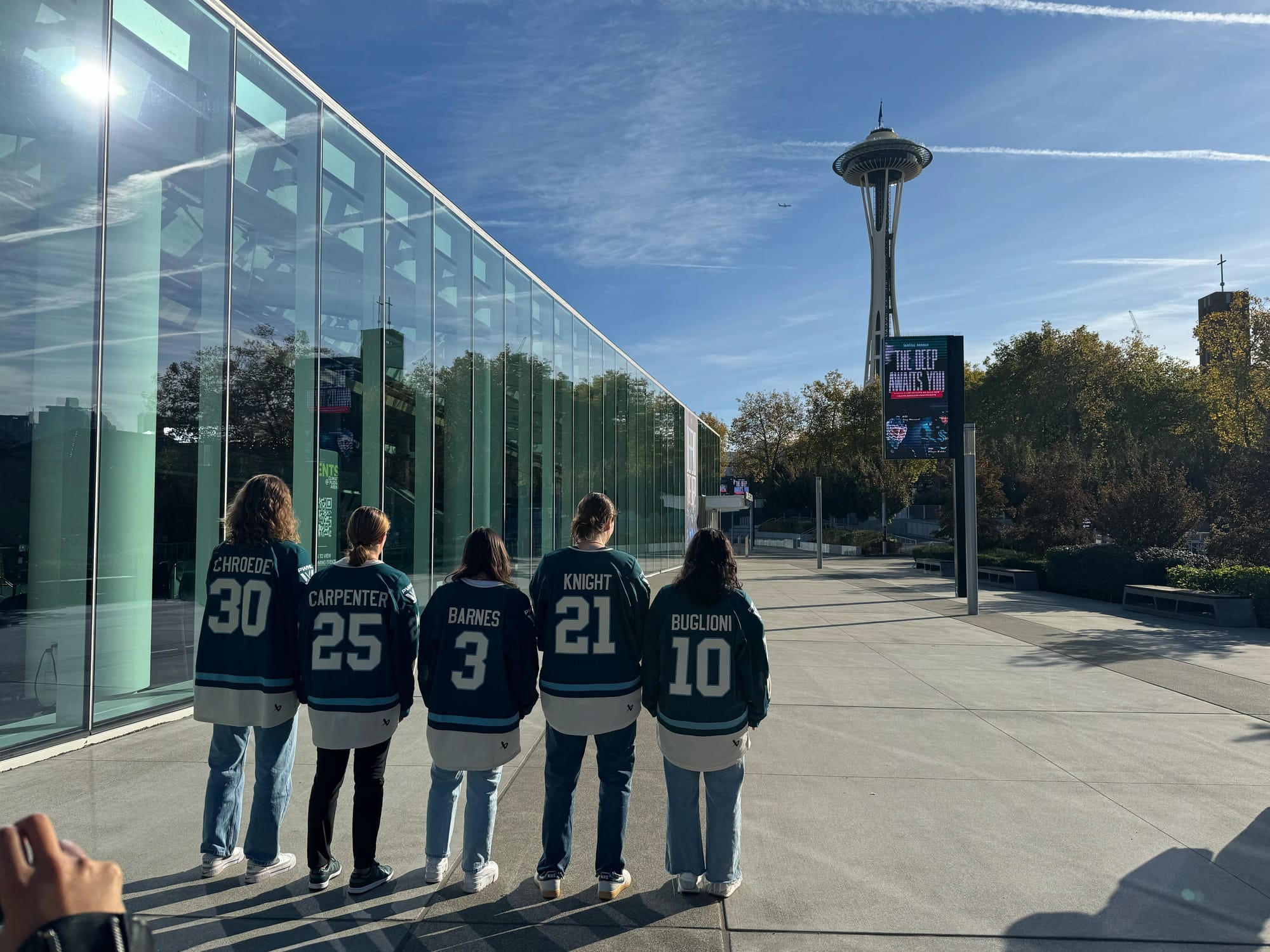
PWHL Seattle’s colors are described as “deep slate green and cream with a river blue accent.” Their home jerseys have a green base with text in cream with a light blue outline. The striping pattern on the sleeves features a thick cream band, followed by a thin open space and a thin light blue stripe. This pattern is then inverted along the waist. Uniquely, Seattle is the only PWHL team whose home jerseys do not include a shoulder yoke.
Their away jersey is a one-to-one color swap, with green replacing cream and vice versa, while the blue accents remain the same. The only major change between the designs of the home and away jerseys is the addition of a green shoulder yoke for the away jerseys.
A first look at our first threads 🔍 pic.twitter.com/vgPZLW9Hwo
— PWHL Seattle (@PWHL__Seattle) October 21, 2025
Our Thoughts
LJ Bachenheimer: Is it just me, or does the color scheme seem a little Boston Fleet-like? I guess it’s appropriate that Hillary Knight went from one green team to another, then.
I think the cream accents (and lack of a shoulder yoke on the home jersey) do a lot of work to keep Seattle looking different because there isn’t anything particularly special about these. The away jerseys are more effective than the home set, with the colors standing out better against the cream. On the green jersey, the light blue outline on the text gets a little lost. However, I think it’s fun that the striping pattern is reminiscent of PWHL Seattle’s “roommates,” the NHL’s Seattle Kraken, whether that’s intentional or not.
Silvia Leija Rosas: When I first saw the green on Hilary Knight, I too thought we would be getting the Seattle Fleet based on the first look. Perhaps PWHL Seattle took Washington’s title of “The Evergreen State” a little too literally, but even then, the green on the jerseys isn’t very evergreen-y. I have nothing new to say about the cream — we’ve seen it before, and Vancouver did it better.
While I do think it's great that PWHL Seattle is looking to connect its colors to the existing Seattle teams, especially with the previously mentioned stripes à la the Kraken, I think a commitment to a deep blue to really mesh with Seattle sports branding would have been the way to go. Or even better, new colors that still represent the geography and history of Seattle and Washington — my dreams of seeing the city’s cherry blossoms represented with a gorgeous pink will not be forgotten. That being said, the “River Blue” on the stripes is especially dear to me as a lover of Washington state geography — it is less dear to me as an outline on the city name across the chest since it looks less river-like and more like a textbook highlight.
Still, I can say they look pretty cool in person and will look even better when we get the “sea of green” Hilary Knight called for.
Maya Smith: I may be biased since I am covering Vancouver this season, but I don’t like these as much as the Vancouver ones. I agree with LJ, they look very similar to the Fleet jerseys. One of the issues for me is that the green and the teal are too similar. On the Vancouver jerseys, the blue and burnt orange colors are distinct enough that they stand out better.
I do like the possibly unintentional nod to the Kraken, and as much as I think that no women’s league needs a men’s league to make it successful, I think a collaborative environment between the Kraken and PWHL Seattle would be awesome. Both organizations strike me as modern, forward-thinking, innovative teams that can really push the envelope of what’s possible. The more we can get Kraken fans out to support PWHL Seattle, the better!
They’ll look great on the ice, I’m sure, but I’m just not clicking ‘Add to Cart’ right now.
If it were up to you, what should be the new names for the Seattle and Vancouver teams?
LJ Bachenheimer: I was itching for a women’s hockey team to be named the Valkyries before the WNBA’s Golden State stole the moniker, and I still think the Vancouver Valkyries sounds awesome. Similarly, my first instinct for the American expansion franchise was Seattle Summit, but Denver’s new NWSL team already laid claim to that name.
Instead, I’m digging into local symbols. If the PWHL asked me, we’d get the Vancouver Spirit Bears (named after British Columbia’s official mammal) and the Seattle Emeralds (from Seattle’s nickname as the Emerald City). I can just imagine how cool those logos would be.
Maya Smith: I did an entire deep dive on the possible names for PWHL Vancouver. There were a couple of fan suggestions that I liked from that post, including the Vancouver Blazers. Now with the burnt orange colour on the jersey, I could see that one happening. I also like the Vancouver Summit or Vancouver Twilight.
For Seattle, I would like to dredge up the once-disgraced Boston Wicked team name that died before it had a chance to make its debut. Seattle Wicked would be cool (especially as a tie-in to the Emerald City). But I also like alliteration, so maybe something like Seattle Squall.
Silvia Leija Rosas: A few months ago, I put my Washington state history knowledge on display to test some names for PWHL Seattle. Based on the jerseys, though, I can’t imagine any of them sticking. Perhaps Seattle Rivers or the Seattle Tsunami if we really are “skating through the storm.” And not to steal from Maya, but the Seattle Twilight isn’t terrible. Bella Swan did meet Edward Cullen in Washington state.
Inspired by the city that shines through the gray. Built for the ones who skate through the storm. pic.twitter.com/Ep3KMyEvBY
— PWHL Seattle (@PWHL__Seattle) October 21, 2025
For Vancouver, I love the Blazers or the Summit. The first, because I am a history nerd, and the second, because the jerseys have a very “land and sea” theme to them that I can see being tied to a mountain vibe.
Comments ()