
Introducing the Vancouver Goldeneyes
A new PWHL team has landed 🦆
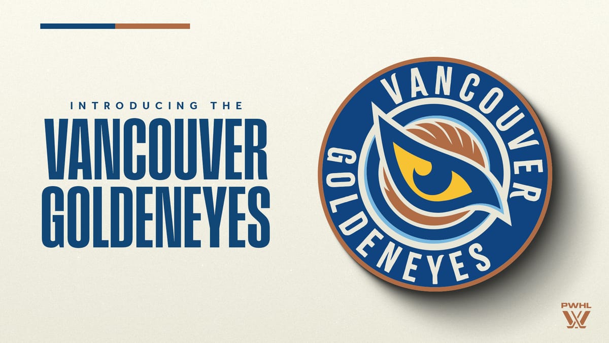
A new era begins; the Vancouver Goldeneyes have hatched!
On Thursday, the PWHL's newest Canadian team revealed its team name and logo in the most Vancouver location: the Coal Harbour Cactus Club.
In front of fans, media, and a variety of Vancouver players, the team revealed the name and logo through a beautiful video.
A force formed in flight.
— Vancouver Goldeneyes (@PWHL__Vancouver) November 6, 2025
We are the Vancouver Goldeneyes. pic.twitter.com/NQQVcck0kO
And while the team name and logo won't be on the jersey this year, the identity still rings true with the PWHL Vancouver jerseys.
The Name
If anyone had the team name being the Vancouver Goldeneyes on their bingo card, please send them my way (and maybe tell them to buy a lottery ticket). It's not a historical name, and it's not the Vancouver Spirit, a name that was leaked earlier this week. And yet, I don't hate it.
"The name Goldeneyes draws inspiration from the Common Goldeneye, a striking bird native to British Columbia's coastal waters and forested lakes. Known for its piercing yellow eyes and lightning-fast reflexes, the Goldeneye is a creature of precision, agility, and resilience—qualities that mirror the game of hockey and the athletes who play it," Ali Bologna, PWHL's Senior Director of Brand & Marketing, explained.
"Known for its piercing yellow eyes and lightning-fast reflexes, the Common Goldeneye is a creature of precision, agility, and resilience—qualities that mirror the game of hockey and the athletes who play it.”
— Vancouver Goldeneyes (@PWHL__Vancouver) November 7, 2025
Learn more about our identity ➡️ https://t.co/1WMIrVT762 pic.twitter.com/0WGKHTrPqk
The first PWHL team named after an animal, the name is unique in more ways than one. It's quite a lot longer than the average team name, and it may prove difficult to cheer, although I know PWHL fans will find a way. It is also a plural name, something only shared by the New York Sirens and the Toronto Sceptres.
It's also one of three with a nature name, something that was important to the league when it came to naming the expansion teams.
"Nature felt so ever-present, so intrinsic to the way of life," Kahan Bhatt-Shah, VP of Branding at the PWHL, said in the media availability after the launch.
She explained that when determining the name of a team, it's important to consider how authentic a name feels to a place, as well as how it relates to the communities and people who live there. Bhatt-Shah also shared that fans had told them that they expected to see names that communicated strength, empowerment, and resilience. And based on the above description from the league, it's clear that they see the Goldeneyes as accomplishing these goals.
For those watching at home, this is what comes up when you search a Common Goldeneye:
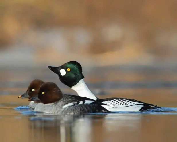
According to Allaboutbirds.org, the Common Goldeneye is a fast flier. They are diving ducks that are streamlined and are between the size of a crow and a goose. Interestingly, they can be found all across North America, which is a complaint I've seen from some fans. It's not a very Vancouver-specific bird. It isn't a very intimidating bird, but I think the name portrays a much less "derpy" image.
So does Vancouver forward Jennifer Gardiner, "'Goldeneyes' has an aura around it that can intimidate others," she said in the team's news release.
Other players really embraced the animal aspect and feel proud to represent the first animal-related team.
"I'm obsessed with it being an animal," said Vancouver goaltender Emerance Maschmeyer, "I've been waiting for an animal with this league for a while now!"
I wasn't sold on the name at first. But then, I saw the logo.
The Logo
The Goldeneyes logo is what really sold me on this identity. The eye logo is incredibly striking, and I love the colour scheme on it.
The team describes the logo as being made up of five things: The Golden Eye, Northwest Orientation, Speed and Agility, Land Meets Sea, and Unity in Motion.
The Golden Eye
As described on the team's assets, "a bold golden eye sits at the heart of the design, a clear and iconic reference to our name, symbolizing vision, clarity, and focus, and paying homage to Vancouver's iconic Goldeneye."
We discussed the name above, so I'll leave that alone. But I do agree that it is very representative of the name, and makes the 'Goldeneye' look very fierce.
Northwest Orientation
"The logo points Northwest, reflecting Vancouver's geographical location and grounding our identity in a strong sense of place," the logo asset describes.
While this isn't something I think an average person would know—I, for one, don't even know what direction I'm facing right now— it is a nice touch. Vancouver is a unique city, and being one of the first two teams in the west is a distinct characteristic of the Goldeneyes.
Speed and Agility
This is described as "inspired by the swift movement of the Common Goldeneye, the wings encircling the central figure speak to our speed, precision, and dynamic spirit."
Yes, this is such a great touch to the logo. I love the wing in the background, and I love that it is the colour of the third colour on the PWHL Vancouver jerseys. It is a bird wing, but it's not tacky or childish. It looks very polished and precise.
Introducing, The Vancouver Goldeneyes 🤩 pic.twitter.com/dbTw99A6hG
— Vancouver Goldeneyes (@PWHL__Vancouver) November 6, 2025
Land Meets Sea
"The curved lines represent the natural meeting point of the land and the ocean, a reflection of the unique geography that shapes the city of Vancouver," the logo asset explains.
I'm not sure that I totally understand how this shows up in the logo. Sometimes, I think these descriptions are a little fabricated and just marketing speak. And I work in marketing, so I'm allowed to say that. Also, would it not make more sense to incorporate the land, sea, and sky? Birds experience all three.
Unity in Motion
Lastly, the logo asset describes Unity in Motion as "the image of a diving bird captures our collective momentum. We move as one, with purpose, grace, and shared direction."
This section, mixed with the Land Meets the Sea curves and the Northwest Orientation, really does evoke the image of a bird diving. I didn't see that at first, but I see it now, and I like the sentiment of it.
All of these descriptions are aided even more by the animation of the logo that the team shared on Instagram.
(Embed this post: https://www.instagram.com/p/DQuUG3igA6l/)
The wink, the way the logo is drawn, it's all perfection. If only we could come up with a way to have moving images on jerseys.
Adding to the level of detail around the logo, the league hired a Vancouver-based designer to create the logo.
"Having a designer from Vancouver design the Goldeneyes logo brought an authentic, local perspective that helped ground the brand in the region's identity from the very beginning," said Bologna.
The Rollout
Included in the team name and logo reveal, the team also released a brand manifesto:
"On the Pacific's edge, where the sea mounts to mist where the tree lines vanish in the sky... distance sharpens the view and vision becomes instinct. We move with the wind. With purpose and unwavering focus. Swift in flight, bountless in view. A clear force of clarity and vantage. Sharp-eyed. Fast-winged. Bearers of vision. All-seeing and all-knowing. Moving as one. Drawn to the edge. Wired to defend. A force formed in flight. WE ARE THE VANCOUVER GOLDENEYES."
The manifesto shows up in the announcement video, read by Canadian artist Lights.
While it was confirmed again in the media availability after the announcement that the jerseys will not include the team name and logo, fans will still have a chance to wear the logo and name this season. The league has released a variety of merch options for the Goldeneyes, available online.
Stand out this season ✨
— Vancouver Goldeneyes (@PWHL__Vancouver) November 6, 2025
Get ready for our inaugural season with all new Vancouver Goldeneyes gear!
🛍️ https://t.co/3qrUyxNeW2 pic.twitter.com/wiFtGOHBwh
Final Thoughts
Overall, the logo and name grow on me more and more as I see them around. I'm very excited to see the rollout of this logo at the Pacific Coliseum and at the home opener. Seeing the logo around the city as well, as fans stock up on merch, and when the jerseys drop in the following season, will be super cool.
The league seems to be dedicated to the idea of PWHL City first, and then logo and team name jerseys in the second season. In the media availability, Bhatt-Shah said that having the PWHL City jerseys is like a rite of passage for the league at this point. She also said that the league feels that the city jerseys and the logo and name can all coexist. We will see if this trend continues as the league continues to expand.
What do you think? If you're reading this, leave a comment with your thoughts, or tweet me (@mayaxeverysport) about how you're feeling!
Comments ()