
An's Data Visualizations Reference
A reference on how to read all of my viz styles featured on The Ice Garden.
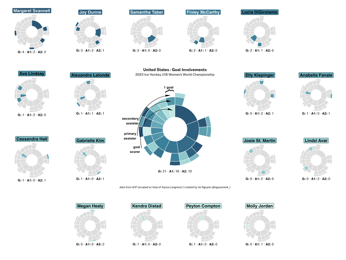
Table of Contents
Data visualizations (or data viz) are a way to communicate data in a format that is pretty and meaningful, sometimes more meaningful than seeing the data in tabular form. Bar charts, line graphs, and shot attempt maps are simpler styles of data visualization, and there are infinitely more (and infinitely more complex) styles yet to be created. Especially for more complex styles, it might be hard to understand exactly what you're looking at.
This page is meant to act as a constantly updating reference on how to interpret the various styles of viz I create using women's hockey data. Keep in mind that while there may be a few key takeaways a data viz is designed to share, there are no wrong interpretations. If you end up accidentally (or by deliberate misleading design) reaching a false conclusion based on a data viz, again, that says more about the visual than about you.
Shot Attempt Maps
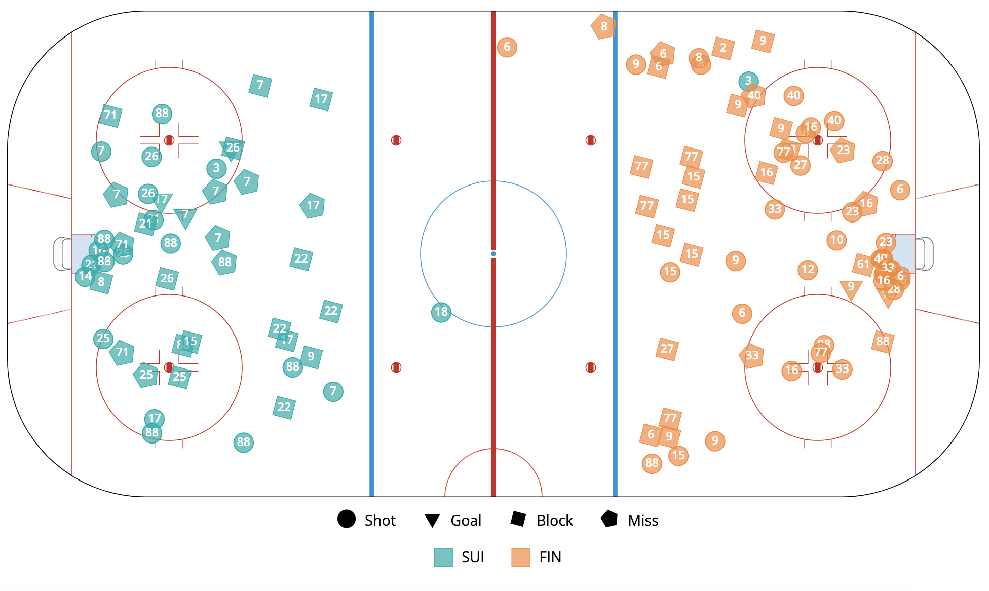
What the Various Elements Mean
- 1 dot = 1 shot attempt
- dot color = team that made the shot attempt (see legend at bottom)
- dot shape = type of shot attempt (see legend at bottom)
- dot location for Shot, Goal, Miss = where the shot attempt was made
- dot location for Block = where the shot attempt was blocked
- number on the dot = the number of the player that made the shot attempt
What to Look For/Key Takeaways
- shot volume: How many shots did each team take? How do they compare?
- shot grouping: Where were most of the shots for a team taken? In the slot? Near the blue line? From the left or right side?
Shot Attempt Heat Maps
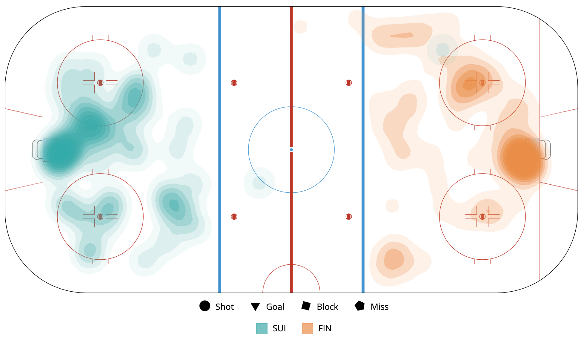
What the Various Elements Mean
- blob = an area of the ice in which shot attempts were taken
- blob color = team that took shot attempts in that area
- blob color intensity = how many shots were in that area, relative to the number of shots taken by that team
What to Look For/Key Takeaways
- shot grouping = Where were most of the shots for a team taken? In the slot? Near the blue line? From the left or right side?
Goalie Fan Viz
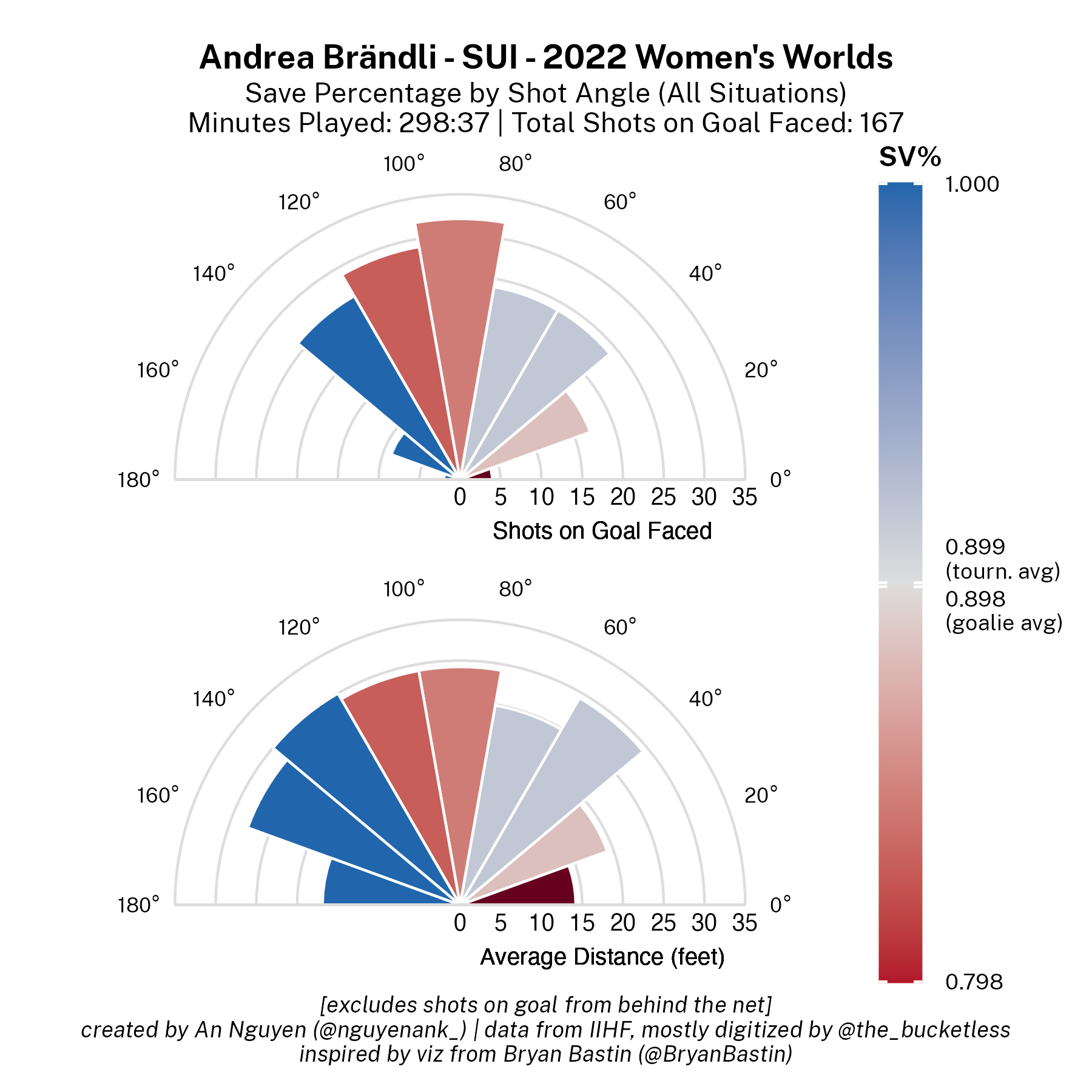
What the Various Elements Mean
- wedge = some statistic about shots the goalie faced coming from that angle range, from the goalie's perspective (i.e. the rightmost wedge between 0 and 20 degrees is information about all the shots the goalie faced coming from their right); excludes shots from behind the net
- wedge color = save percentage for the goalie considering only shots coming from that angle range; see color bar on side
- color bar = ranges from blue for a 1.00 / 100% save percentage, to grey for the tournament average save percentage, and red for the same difference between 100% save percentage and the tournament average below the tournament average (???) (e.g. if the tournament average is save percentage is 0.91, that is 1.00-0.91 = 0.09 points difference, so the brightest red on the color bar would be 0.91-0.09=0.82), a dark maroon is not listed on the color bar but represents any save percentage below the lowest save percentage labelled on the color bar; the goalie overall average is also labelled
- wedge length on the top semi-circle = how many shots on goal the goalie faced coming from that angle range
- wedge length on the bottom semi-circle = the average distance, in feet, that shots on goal the goalie faced from the angle range came from
What to Look For/Key Takeaways
- shot volume: Did the goalie face most of their shots from the left or right side, or down the middle? On average, were there a lot of shot from far or closer?
- save percentage across angles: Was the goalie stronger on their left or right side, or down the middle?
Goal Involvement Sunburst Viz
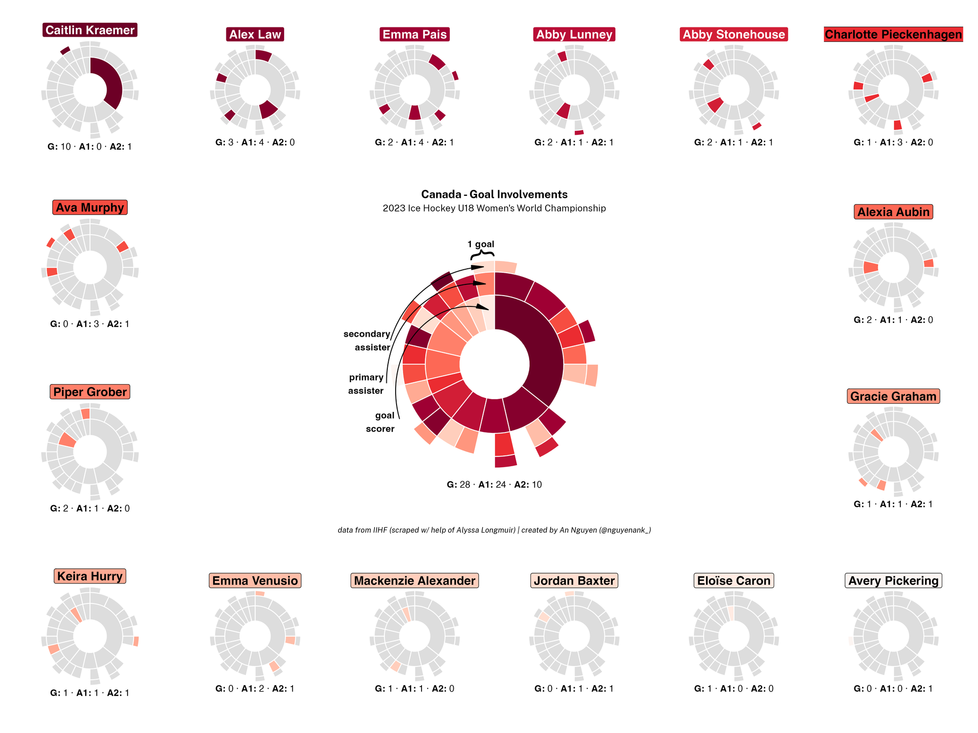
What the Various Elements Mean
- center sunburst = a representation of all goals scored by that team, broken down by goalscorer, primary assister, and secondary assister
- label below center sunburst = the number of goals, primary assists, and secondary assists scored by that team
- one vertical wedge of the sunburst = a single goal scored by the team, with layers (from inner layer to outer layer) representing the goalscorer, primary assister, and secondary assister
- each ring layer of the sunburst = from inner to outer layer = the goalscorers, primary assisters, and secondary assisters
- wedge color = a particular player for the team; palette is loosely matched to the team, but there is no guaranteed meaning behind lighter/darker colors
- colored player label = the color representing that player in the wedges
- individual player sunbursts below their label = identical to the center sunburst, but greying out all wedges that are not the player's to highlight that player's goal involvements
- label below player sunbursts = the number of goals, primary assists, and secondary assists scored by that player
- player sunburst order = the player sunbursts are ordered by number of goal involvements by that player (ties broken by number of goals, then number of primary assists, then number of secondary assists); the player with the most will be in the top left and will go in order left-to-right, then top-to-bottom. any gaps in sunbursts are purely aesthetic and have no meaning
What to Look For/Key Takeaways
- goal involvement distribution: Which player had the most points/goal involvements?
- goal/assist distribution: Looking at the individual ring layers, which player had the most goals for the team? Most primary assists? Most secondary assists?
- teammate connections: Which players were involved with goals with many different players? Which players were only involved with goals with the same few players?
Time on Ice Breakdown Sankey Chart
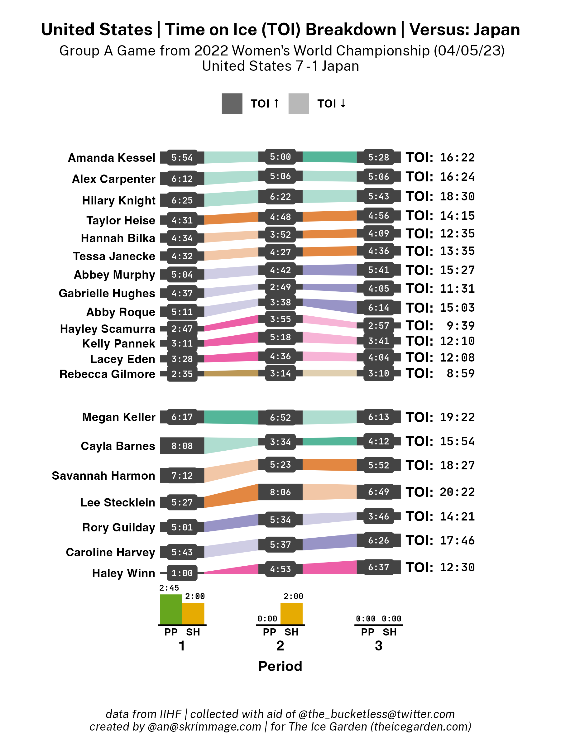
What the Various Elements Mean
- grey rectangle, occasionally with a grey rounded rectangle shape in the middle = the time on ice for the particular player (labelled on the left, going across) for the particular period (labelled on the bottom, going up)
- height of the grey rectangle (not the rounded rectangle inside, if there is one) = the relative time on ice
- rounded rectangle = just to accommodate the text inside; if there is not one present it just means the grey rectangle was tall enough without a rounded rectangle to encapsulate the text
- text inside the grey box or rounded rectangle = the time on ice for the player for the period, represented as M:SS, where M=minutes and SS=seconds
- the colored quadrilaterals connecting the grey rectangles = meant to better illustrate how the times on ice change between period for a given player, based on how much the colored shape narrows or widens when going from period to period when looking left to right
- the color of the colored quadrilaterals = groups line mates (as determined based on the submitted roster) together, as linemates will have the same color for their colored quadrilaterals
- saturation of the colored shape = duller color indicates the player's time on ice went down from the period on the left side of the quadrilateral to the period on the right, while a more saturated/brighter color indicates the player's time on ice went up; see legend at top
- text to the right of grey shapes and colored quadrilaterals = the total time on ice for the player
- bar charts below players = indicate time spent on the power play (PP) or short-handed (SH) for the team and the opponent team per period
- bar height = the relative time spent on either the power play or short-handed
- bar color = help distinguish the two options; power play is always green and on the left while short-handed is always yellow and on the right
What to Look For/Key Takeaways
- player time on ice distribution: Who had the highest time on ice on the team? Was the time on ice relatively even or did some players have far more time on ice than others?
- player time on ice changes between periods: How did a player's time on ice change across periods during games? (Note: this is subject to many factors not adequately expressed in this graph, like score differential per period, special teams, outside circumstances like injury, etc, and is relatively prone to natural variance given it considers on a single game. Make any potential explanatory claims about with several heaps of salt grains and/or context.)
- inter-line dynamics: Was there a clear hierarchy to how much time on ice various lines played (i.e. a clear 1st, 2nd, 3rd, and 4th line in terms of time on ice) or did some lines see relatively similar ice time? Did this hierarchy change throughout different periods?
- intra-line dynamics: Did players listed as being on the same line have time on ice relatively similar to their linemates?
- special teams: How much time did the team spend on the power play versus short-handed each period?
Goal Involvement Sunburst Viz (All Teams)
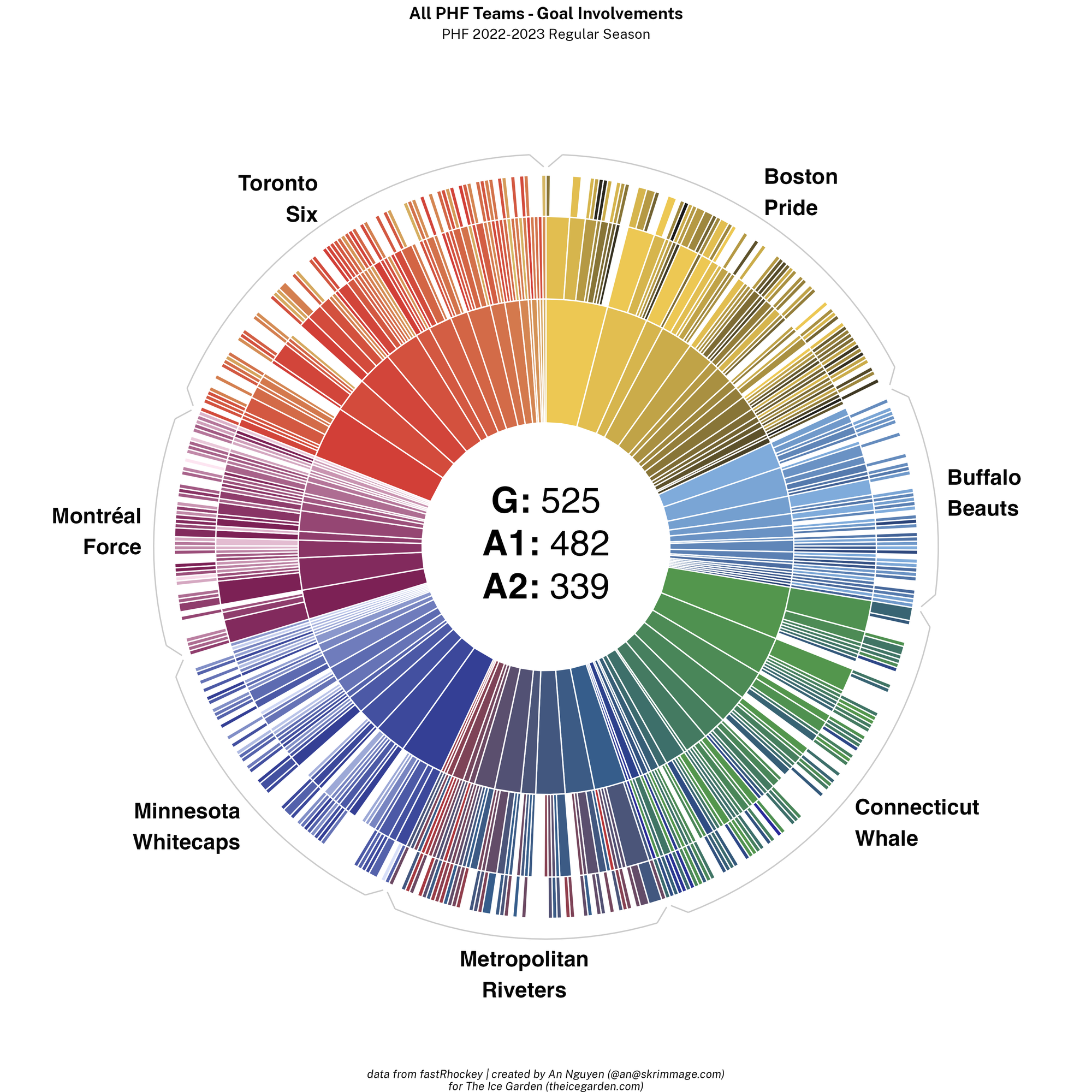
What the Various Elements Mean
- sunburst = a representation of all goals scored in that season/competition, broken down by goal scorer, primary assister, and secondary assister
- label inside center sunburst = the number of goals, primary assists, and secondary assists scored by that team
- one vertical wedge of the sunburst = a single goal scored, with layers (from inner layer to outer layer) representing the goal scorer, primary assister, and secondary assister
- each ring layer of the sunburst (from inner layer to outer layer) = the goal scorers, primary assisters, and secondary assisters
- wedge color = a particular player for the team; palette is matched to the team, but there is no guaranteed meaning behind lighter/darker colors
- grey bracket grouping vertical wedges together with a label next to it = all goals scored by a certain team
What to Look For/Key Takeaways
- number of goals: Which team has the most goals?
- goal/assist distribution: Looking at the individual ring layers, which teams had a few players have the majority of goals and assists, versus which teams had their goal involvements more evenly distributed amongst players?
Goalie Quick Comparison Viz
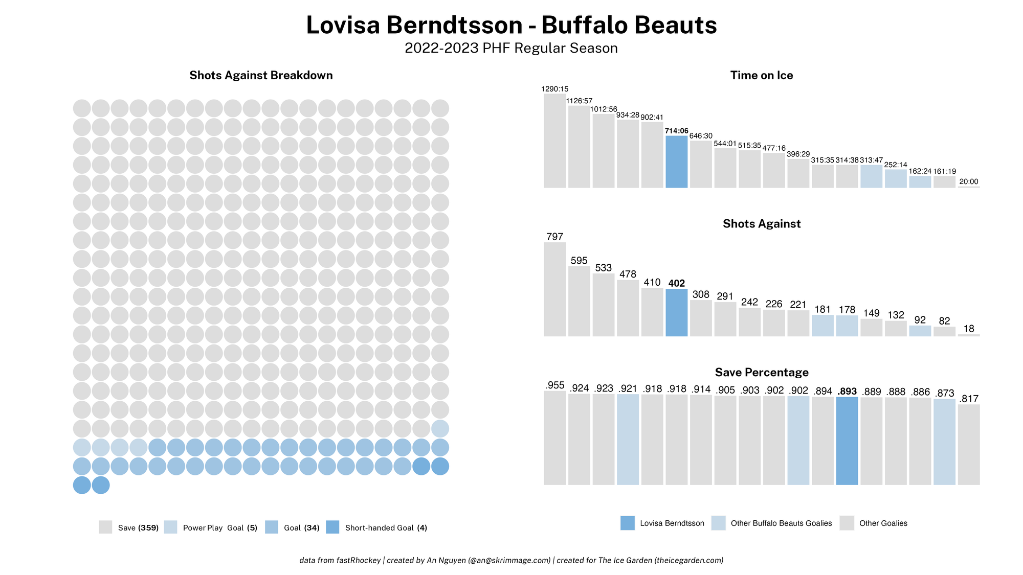
What the Various Elements Mean
- left grid of circles = a wafflesque chart representing all of the shots-against the goalie faced; every row has 20 circles
- one circle = a single shot against
- color of the circle = the result of that shot against (consult the legend below the grid of circles); greyscale colors indicate a save; non-greyscale colors indicate a goal against, with the lightest indicating a power play goal against, the medium color indicating a regular goal against, and the darkest color indicating a shorthanded goal against. the exact hue of the non-greyscale colors is based on the team the goalie plays for
- legend labels = unbolded text indicates the shot against result for that color; the bolded number in parentheses afterward indicates how many shots against with that result occurred
- series of labelled rectangle bars on the right = bar charts comparing the goalie's stats to those of all other goalies in the league/competition; from top to bottom is time on ice (with the label in minutes:seconds), shots against, and save percentage
- bar color = which goalie the bar represents (consult the legend below all of the bar charts); the darkest color is the goalie represented by the viz; the light color are goalies playing on the same team as goalies represented by the viz, and the light grey is any other goalie in the league/competition; all goalies in the league/competition have a bar unless otherwise stated
What to Look For/Key Takeaways
- goal against types: What was the most common situation the goalie had goals against during — power play? Shorthanded?
- workload based on time on ice: Does the number of shots against the goalie faced roughly line up with how much time they were on the ice — e.g., if they had the third-highest time on ice, did they face the third-highest amount of shots against? How much of a difference is there compared to the second- and fourth-highest amount of shots against?
- performance relative to other goalies: How was the goalie's save percentage in comparison to other goalies, keeping in mind how many shots they faced and how long they were on the ice and keeping in mind other not provided context like difficulty of shots/situations? How about in comparison to other goalies on their team?
Minute by Minute Wafflesque Viz
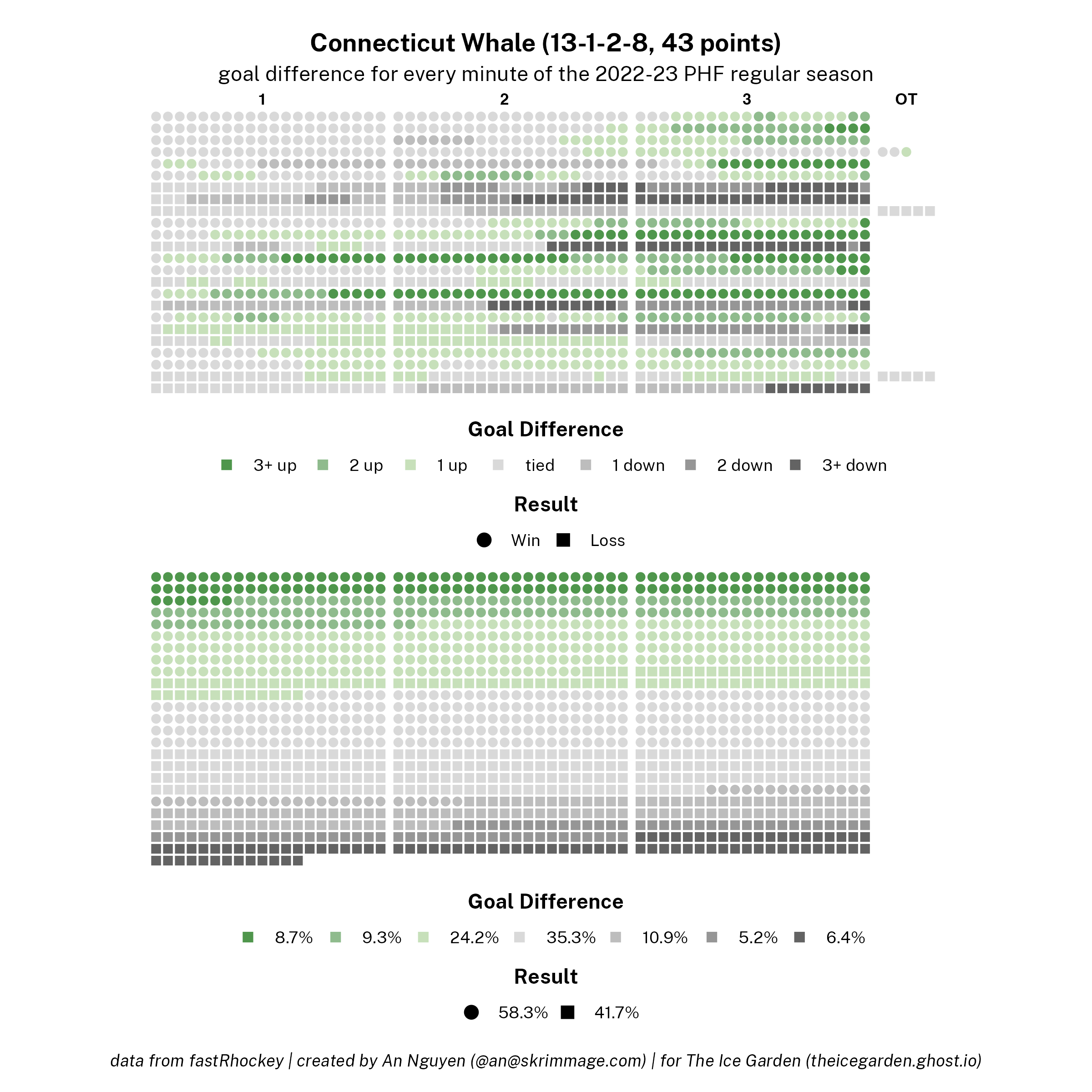
What the Various Elements Mean
- title = the represented team in question, their results (with the numbers corresponding to: regulation win – overtime win – overtime loss – regulation loss), and the number of points they scored during the season
- a single dot (square or circle) = a single minute of the regular season, rounded up to the nearest minute (i.e., if a game ended in overtime after fifteen seconds, that fifteen seconds would be rounded up to be represented by a whole dot)
- dot shape = whether the minute took place in a game that resulted in a win (circle) or loss (square) for the team
- dot color = the goal difference between the represented team and their opponent during a game at the end of the minute (i.e., if at the start of the minute the game was tied, then within that minute the represented team scored twice and their opponent scored once, the color would reflect that at the end of the minute the represented team was up one goal); non-greyscale colors reflecting a team color indicate the represented team had a positive goal difference and was thus winning; greyscale colors indicate the represented team had a negative goal difference and was thus losing, and more intense colors indicate larger goal differences (whether negative or positive)
- upper grid of dots = every minute of the regular season, organized chronologically
- one row of dots in the upper grid of dots = a single game of the regular season; there is a small gap after every group of 20 dots to provide separation to indicate periods
- labels on top of the upper grid of dots = indicate the corresponding period for the group of dots (1, 2, 3, OT)
- legends below the upper grid of dots = how the colors correspond to goal difference; the shapes correspond to a game win/loss
- lower grid of dots = every minute of the regular season, organized by goal difference (going from most positive to most negative) and then game result (wins then losses); there is still a small gap after every group of 20 dots, but the gaps have no meaning in the lower grid besides to mirror the appearance in the upper grid
- goal difference legend below the lower grid of dots = the percentage of minutes that ended with the goal difference corresponding to that color; order is the same as in the legend below the upper grid and going, in order: 3+ up, 2 up, 1 up, tied, 1 down, 2 down, 3+ down
- result legend below the lower grid of dots = the percentage of games that ended in either a win (circle) or loss (square), corresponding to the same shapes–results as in the legend below the upper grid (note: this may differ slightly from the percentage of minutes in game that ended in a win or loss given extra minutes due to overtime)
What to Look For/Key Takeaways
- game scoring flow: Did the team tend to take a lead or go down early and have it stay that way throughout the game, or did the team have lots of games where the goal difference swung back and forth? Did the team have a lot of games that went to overtime? Were there a lot of games where the score difference flipped and the game result was decided in the third period?
- goal difference and results proportions: What percentage of minutes was the team up on goals as opposed to down on goals? How does that compare to the team's win/loss results? How many minutes did the team have a one-or two-goal lead and end up winning versus losing those games in the end? How many minutes were the team behind one or two goals and end up winning or losing those games in the end?
Shots and Goal Times per Period Overlay Chart
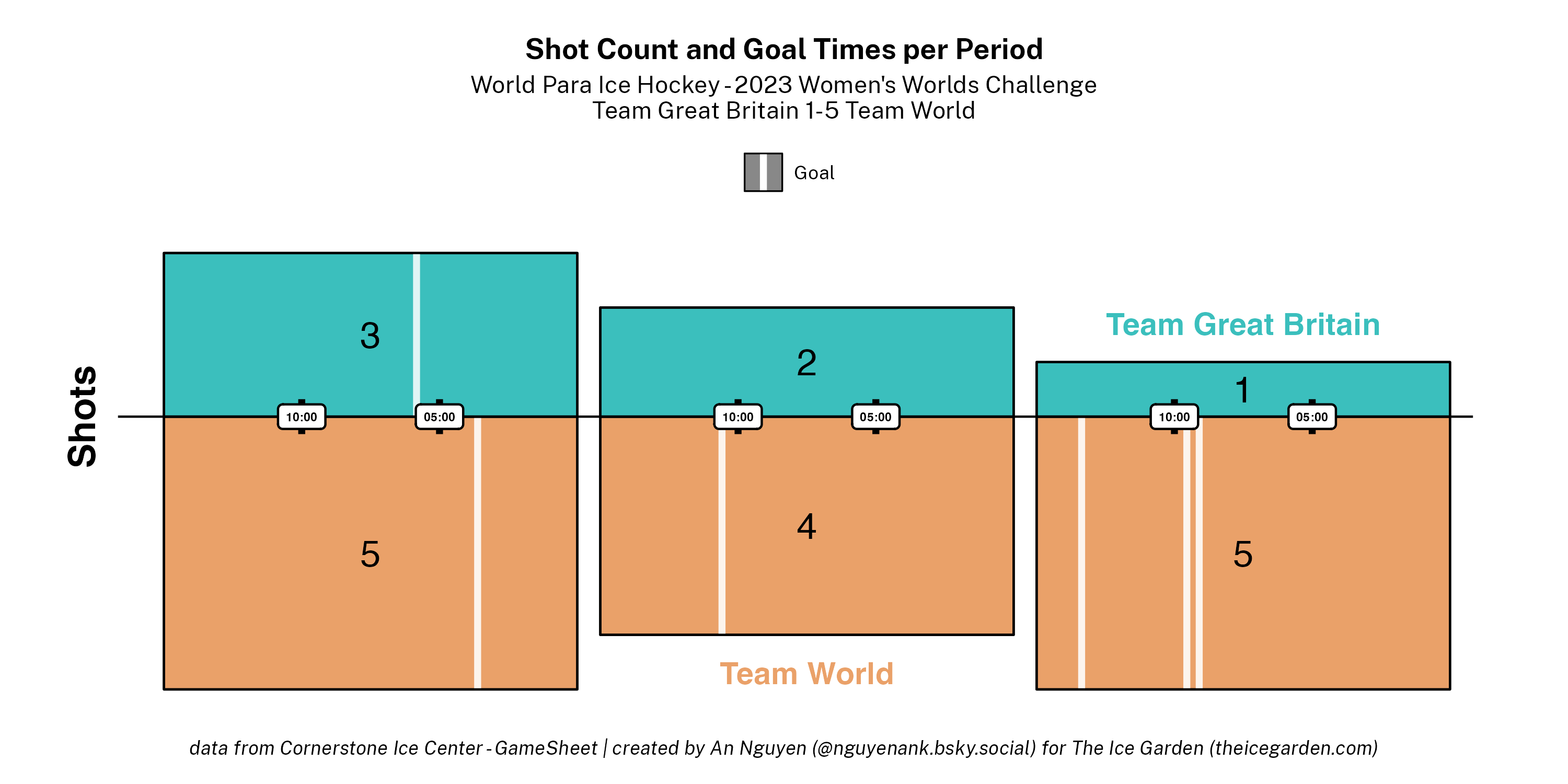
What the Various Elements Mean
- Blue+orange rectangle: a given period (1-3 and possibly OT, going left to right)
- Color of a rectangle section: a team in the given period; blue represents the home team and orange represents the away team
- Colored text above/below a rectangle: the name of the team represented by the color of the text; e.g. Team World is in orange so the orange sections of the rectangles represent Team World (and Team World is the away team per the previous bullet point)
- Height of a rectangle: the number of shots taken in the period represented
- Height of a colored rectangle section: proportional to the number of shots taken by that represented team in the period represented
- Black number in the middle of a colored rectangle section: the number of shots taken by that represented team in the period represented
- Width of a rectangle: the time duration of a period
- White rectangles with rounded corners overlaid on black vertical rectangles and containing black text straddling the two colored rectangle sections within a rectangle: markers indicating the time remaining in the period per the label; the vertical rectangles act as little axis tick marks indicating the exact location of the time indicated
- Light-colored vertical stripe on the colored rectangle section = a goal scored by the represented team in the represented period
- The horizontal position of a vertical stripe within the rectangle = the time at which the goal was scored
- The type of line (solid, dashed, dotted): the strength at which the goal was scored; there is a legend above the rectangles that has examples, but solid = even strength, dashed = power play, dotted = short-handed
What to Look For/Key Takeaways
- Shot numbers across teams: Which team took the most shots in a period? Which team took the most shots overall?
- Shots numbers and goals across periods: Which period were there the most shots? How does that relate to the number of goals scored in that period?
- Goal timings: When were goals scored? Were they at the start or the end of periods? Were there multiple goals in succession or long gaps between goals?


Comments ()