(Re)imagining PWHPA Teams
We’re starting to get Dream Gap Tour rosters, so lets have some fun with hypothetical names and jerseys.
The first set of PWHPA Dream Gap Tour rosters has dropped and the hype has started to build. While we don’t know what the jerseys will look like yet, it seems that the teams are just named after their captains— Team Johnston, Team Knox, Team Poulin, and Team Jenner.
Related
PWHPA Announces Sponsors and Details for the Dream Gap Tour
I took the team rosters and regions and created something a little more traditional, but still fresh. The PWHPA does have regions, but it’s clear from the names of their teams that they’re toying with the idea of having more discrete connections between places and teams, which is why none of the teams I mocked up have places in their names even though their regions often influenced both the name and jersey design.
I don’t own any of these logos or the template (which you can find here if you want to make your own).
The Prowl
Team Johnston’s roster for the Toronto stop on the Dream Gap Tour is very reminiscent of last season’s Calgary Inferno. Accordingly, as the PWHPA’s Calgary region team, their jersey should reflect their roots. Like the Inferno before them and the Flames, Roughnecks, and Hitmen, the jerseys could be black, red and yellow. Bobcat sightings are becoming increasingly common in the Calgary area and are a fun and not terribly popular animal mascot.
The Cadettes
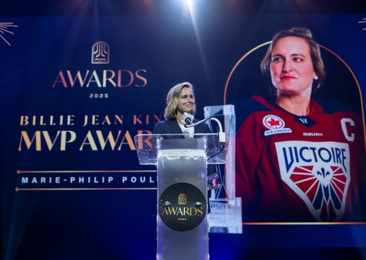
Who doesn’t love a good fleur-de-lys? There would be no mistaking that this is the Montreal-region team, and it would stick with the red, white and blue of the Canadiennes and Canadiens without relying too heavily on those brands. Given that Team Poulin is largely former Canadiennes, I can imagine many of them would be comfortable repping Quebec moving forward.
The Rogue
The Rogue isn’t just a river in Ontario. (Pause for laughter). Okay, but seriously, what a cool name for a river and what a cool name for a team in the Greater Toronto Area like Team Jenner. The seafoam is a slight nod to the old Brampton Thunder days when there was just that little splash of blue in the logo, but it’s also on-brand for a water-themed team. Yes, I know there aren’t any octopuses in rivers, but it’s sort of supposed to be more of a river monster. (Octopuses is the correct English plural; it’s not Octopi because it has a Greek root, not a Latin one!).
The Wolfpack
You can’t have a Toronto-area team that’s not blue. I’m pretty sure it’s a law. That being said, the wolf is a well-loved mascot and Ontario’s wolf population hovers somewhere around 9,000. Not to mention hockey players love the term ‘wolfpack’ and related phrases like ‘legs feed the wolf,’ so the branding potential is endless. Team Knox has a lot of former Toronto Furies on the roster who we know look good in blue.
The Battery
Buffalo is known as the Queen City due to its former prosperity as the largest city along the Great Lakes during the late 1800s. While ‘queen’ may automatically bring to mind a crown, it would be fun to see an alternative take on the word. A ‘battery’ is a chess move not unlike a battering ram, where two pieces (often a queen and rook or queen and bishop) line up and point in the same direction to control a rank, file, or diagonal. Similarly, a team has to move in unison to be effective. The name also brings to mind the gritty style of play that Buffalo women’s hockey has become known for, so it works on two levels.
The Swift
The chimney swift is one of many kinds of birds you might see in southern Canada and the American Midwest. It’s a quick, agile bird that lives and hunts in groups and would make a good alternative to your usual bird mascots. The name ‘The Swift’ also sounds particularly cool in singular form and can be added to the last name of any player to make them sound like a fantasy protagonist: Kendall Coyne-Schofield The Swift is fun and accurate. The color scheme was inspired by a friend describing a winter scene in the American Midwest, and it’s also a combination of colors we don’t often get to see on the ice.
The Vanguard
The hardest thing about having a New England team is avoiding making it a Boston team. In an effort to avoid lumping all of New England together, many facets of which might not be particularly excited to don Beantown’s typical yellow and black, I went a different direction. The word ‘vanguard’ means both a progressive group of people at the forefront of new ideas and the furthest forward section of an advancing army. I chose it as a nod to ‘Cell 16,’ a progressive feminist organization that existed briefly in Boston during the late 1960s and published their own newsletter called No More Fun and Games.


Comments ()