2017 Women's Hockey Uniform Rankings
Do you want to be on top?
The beginning of the 2017-18 season has seen a bit of a shakeup in the world of women's hockey uniforms; with two new pro teams, relocations and rebrandings, there are a variety of new looks gracing the ice this season.
Here at The Ice Garden, we decided to find out what exactly the best uniforms in women's hockey were. We narrowed down our top 10 from a list of the 24 professional teams we covered most, stretching across four leagues and three continents.
The Panel:
In order to make the list as fair as possible, we comprised a panel of industry professionals and split them into three categories: Writers, Designers, and Photographers/Videographers. Each brought their own unique outlook, experience, and criteria for what makes a good uniform.
Fifteen total panelists were selected, including uniform and jersey experts such as Dylan Nowak and John Vander Woude, women's hockey photographers including Chris Tanouye and Michelle Jay, and videographers like Michael Smith, alongside an assortment of TIG writers, designers and photographers.
The Rankings:
Panelists were asked to rank each uniform, with five being the best and one being the worst. The scores were then ranked by the mean score, with standard deviation being taken into account only to decide who got to sit higher in this article (while still remaining tied in the actual rankings).
For the purpose of the viewing audience (that's you!), the results are displayed as the overall score, and then a break down of what the average writer, designer, and photographer/videographer ranking was for that uniform.
The Top 10
10 - Luleå Hockey
As the only SDHL team to crack our top ten, Luleå did so in striking fashion. Their uniforms were a break away from the norm. These jerseys stood out with not only their striking logo against the black fabric, but also with some sharp striping providing a pop of color.
Panel Comment
I like the sharp contrast of black and strong colors like red and yellow. The shoulder stripes give it shape and structure; overall it's very visually pleasing to me.
- Meredith Foster
9 - Melbourne Ice
Melbourne Ice are perhaps the most successful Australian Ice Hockey club, winning five championships in their first six years in the league after their amalgamation with the men's team of the same name. Their jerseys, however, remain uniquely theirs. The ‘ice’ white color pallet only serves to draw further attention to a logo that in Australian Ice Hockey circles is synonymous with success.
Panel Comment
For starters, I love the M logo. I also like that it’s a minimal jersey design. The white looks well with the classic colors. The shoulder yolks are a nice touch too.
- Michelle Jay
8 - Sydney Sirens
Coming in one place ahead of their AWIHL foes are the Sydney Sirens. The star patches on the Sirens shoulders provide a point of interest; the yellow striping on both the jersey and the socks tie in nicely with the yellow of the logo while still allowing their primary color of red to take center stage. The jersey is one that has quickly become a fan favorite.
Panel Comment
I loved the color scheme of the Sirens jersey. I also love the name, which probably influenced it a bit. It's a perfect name and the logo fits it so well. The jersey is clean, too - it's not trying to do too much. I'm also a big fan of the stars on the shoulders.
- Hannah Bevis
(T)6 - Boston Pride
Placing second in the NWHL’s Twitter poll for the best new jersey this season, the Pride are back and have departed from the white of last season with a new logo to replace the claw marks that have been the team's signature since their inaugural season. Even with their secondary logo of a paw print on both the shoulders and lower pants legs the black jersey really allows for their new logo (which has been announced as a nominee for a Creamer Award in the Best New Primary Logo category) to really stand out and take center stage.
Panel Comment
The Boston Pride don a clean, simple jersey. Importantly, the design includes good color separation between the team's logo and the black fabric of the jersey's body. The yellow, white, and black tie in with the traditional colors of other Boston sports teams, linking the Pride to the city's sporting identity. The paw print decals on the shorts and shoulders tie the theme of this kit together. The combination of all these elements makes the Boston Pride's uniform one of the best in the NWHL.
- Michael Smith (Grassroots Sports)
(T)6 - Vanke Rays
While a new addition to the CWHL this year Vanke has certainly been making waves around the league with their sharp home jerseys. The combination of the white and black while having the potential to be boring instead looks sharp the colors starkly juxtaposed against each other while the red accent provides a bright pop of color and a tie in with their logo.
Panel Comment
What I like about the Vanke kit is the overall color scheme of black, red and white all just flows. My only problem is the word plate of "VANKE" on the bottom of the jersey, if it weren't for that and for my complete bias towards Toronto, the Vanke jersey would be my top pick.
- Chris Tanouye (Photographer - Toronto Furies)
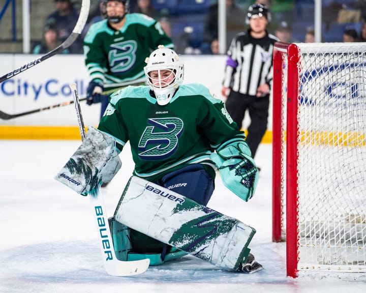
5 - Connecticut Whale
The inaugural Connecticut Whale jersey was one of the most popular jerseys among women's hockey fans, with people falling in love with the connection to the old Hartford team and also to wave imagery on their jerseys.
While the team departed from many of their more interesting elements last year, this year has seen the return of the wave in dramatic fashion. Not only did the wave return on their jersey, pants, and socks, but the addition of their secondary logo of the sole whale as a shoulder has added a nice touch of interest to the uniform. While the Whale this year have fallen victim to the NWHL “one white jersey” rule, the use of the primary colors of green and blue across the jersey provides the uniform with the necessary pop to avoid it looking too plain, instead creating a well thought out and interesting uniform set.
Panel Comment
The Whale’s jersey balances traditional hockey jersey aesthetics with well-executed unique elements (like the wave in the striping). Mix that with the excellent royal blue/green palette, it creates a jersey that’s got personality and originality while still including the traditional elements that make hockey jerseys so great,
- John (HockeybyDesign)
4 - Kunlun Redstar
When we first heard news of the CWHL China expansion, the Red Star uniform is exactly what I pictured, with strong notes of China's national colors of red and gold as the centerpiece of this uniform. Similar to the Melbourne Ice, Kunlun manages to pay homage to their men's teams that compete in the KHL while simultaneously giving the women's team their own unique look. The uniform manages to work seamlessly with their frankly fantastic logo, with the black stripes on the sleeves and socks really pulling the uniform together as they tie together the jersey, the pants, and the logo.
Panel Comment
I'm not usually crazy about the color red but they are the Red Stars and Kunlun, with their black and gold accents have made me a fan. The color scheme is bold. The logo is exciting. The details are simple and clean. I'd love to see some of the gold stripe details replaced with white to really make that dragon stand out but overall this is a fun, no-fuss jersey that looks awesome on the ice.
- Monica Roebuck
(T) 2 - Toronto Furies
After undergoing a major redesign a couple of seasons ago, the Furies have managed to forge themselves an identity that fits perfectly within the Toronto Hockey Palette while also uniquely being theirs. The trio of stripes on the socks provided a particular point of interest while the dual stripes on both the jersey body and on the sleeves provide just enough similarities between these jerseys and that of the Maple Leafs, Marlies and Junior Marlboros that the uniform has a familiar feel, even from first viewing.
Panel Comment
The Toronto Furies rebrand was a fantastic example of a club developing an identity that would fit in effortlessly alongside their local neighbors—without screaming out “Lady Leafs!” The Furies’s shift from a simple wordmark to a well-designed graphic identity gave a professionalism to the team and reinforced its ties to the Toronto area by pulling in elements from Maple Leafs and St. Pats logos past. But just what is it that elevates the Furies above the field? Those beautiful striped socks that have been a staple of the franchise since the beginning.
- Emily Scherer (FiveThirtyEight)
(T) 2 - Calgary Inferno
While once formerly nicknamed the Honey Badgers playing in blue and yellow, Calgary's partnership with the Flames eventually led to them to their current iteration. The primarily black sleeves form a visual connection with players shorts which only serves to draw more attention to what might be one of the best logos in Women's Hockey. While very little difference exists between the Infernos Jersey and that of the Flames, I dare say that the current look works much better for the CWHL team than its NHL counterpart with the black secondary color tying in, but not overpowering, the primarily black and grey logo.
Panel Comment
The Calgary jersey is one of my favorites. The mixing of red and yellow with the black truly capture the name inferno and is very aesthetically pleasing to anyone who likes darker jerseys. With the only other red of the original teams being Montreal they have stood out nicely. Plus the logo captures that it is women's hockey while being different and intriguing.
-Nathan Vaughan
1 - Les Canadiennes de Montreal
It seems almost fitting that one of the most decorated franchises in women's hockey history should also be ranked the highest in regards to the overall look of the team. It's Bleu, Blanc and Rouge, because could a hockey team ever wear anything different in one of the most hockey saturated cities in the world? There was really no other option for the Les Canadiennes regarding the base design of their uniform.
However, for me what is most impressive is how the starred C looks just as much at home in the center of the jersey as the famous CH. The Canadiennes have made this jersey their own.
Panel Comment
Maybe I'm a traditionalist and I realize they are trying to portray the Montreal Canadiens but the uniform just looks fantastic. I'll never get sick of that red and blue combination with that beautiful chest stripe. No, it's not an original design for the team but there is no arguing they look great on the ice. One thing to comment on is the logo. Again, while it draws ties to the NHL Canadiens logo, it differs itself just enough to bring something new to the table. No, it's not an original design but I can't sit here and say it's a bad jersey because of it. They are the Montreal Les Canadiennes after all. I think it'd be a sin if they strayed far from this look.
- Dylan Nowak
Special mentions:
Adelaide Rush
Adelaide underwent a massive redesign just last season after the previous team (the Adelaide Adrenaline) failed to submit for the 2016-17 season, causing a last minute scramble for everything from team registration papers to uniforms. The result, however, was these classic blue and red thread that look fantastic on the ice despite their relative simplicity.
Brynäs IF
Some teams have the gift of being able to depart from jersey tradition so seamlessly it seems ridiculous that no one had ever done it before. To me, that’s Brynäs shoulder striping. The red and yellow pair together excellently against the black to form a well-designed point of interest.
Buffalo Beauts
While the move to a completely blue jersey was not one that was welcomed by all fans, with many mourning the loss of last seasons championship jerseys, the stars on the shoulders and arms provide an interesting addition as they cascade down the player's arms.
For a look at all uniforms that were included in the vote, head to Alyssa’s 2017-18 Women Hockey Uniform Guide on Twitter.


Comments ()