Boston Pride unveil new home and away jerseys for 2020-21 season
Uh-huh, you know what it is, black-and-yellow...
The Boston Pride are the latest NWHL team to unveil their new home-and-away kits for the 2020-21 season.
🚨JERSEY REVEAL🚨
— Boston Pride (@TheBostonPride) November 12, 2020
————————-
Our new jerseys are hype! Head to our merchandise store ( https://t.co/u6grM8zruf ) to purchase your Season 6 jersey!
Home or Away? Which one are you copping? 😎#jerseyreveal #revengetour #bethehunter #season6 pic.twitter.com/PeCAS6wLtV
The Home Sweater
Bright yellow is a hallmark of the Boston Pride’s aesthetic, and it’s the cleanest it’s ever been in the newest design. At first glance, the hue has been toned down more to a gold shade as opposed to the neon of the last two seasons, a change which works very well with the black-and-white piping along the chest.
Speaking of, I’m a total sucker for mid-sweater striping. It’s such a classic hockey look, reminiscent of the game’s origins. Ironically, the first team that comes to mind when considering the history of that look is Boston’s arch-rival, the Montreal Canadiens. Le Canadiennes de Montreal also adopted that look in the CWHL, as have several other NHL clubs looking for a throwback in a Winter Classic setting (see 2009 Blackhawks, 2020 Predators, etc).
But something about this old-school design feels very modern. Using two colors for the striping as opposed to just white or black is a uniquely slick look, and that crest ties everything together perfectly. Couple that with solid white numbers with no extraneous stripes or slash marks obscuring the view, and this is a heck of a design.
The Road Sweater
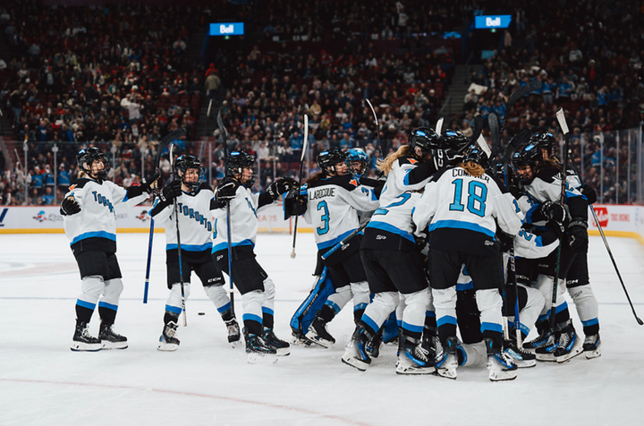
The NWHL has never shied from the daring in their sweaters. They have liberally used watermarks and patterns to break up the monotony of a base, as they did with their Nashville All-Star jerseys and their new white Toronto Six alternate. While personally the white Six sweater is a bit much for my taste, it’s refreshing to see such bold chances taken in a generally stylistically stagnant sport.
What the Pride have done with their road jersey is combine the NHL’s two ideas of high fashion: regurgitating designs from 20 years ago and black alternates. So they’ve taken the black base and added the color gradient from the Vancouver Canucks’ 2001 sweater to make a gradual black-to-gold fade.
Does it work? Certainly better than other attempts at gradient designs of late. Looking at you, Tampa Bay Lightning.
2004 meet 2019!
— NHL (@NHL) February 8, 2019
Full stealth mode tonight for the @TBLightning in these 🔥 black and gray @adidashockey jerseys! pic.twitter.com/wOQHsMigZh
The piping is limited to two thin stripes of yellow on the sleeve, with nothing but a Boston wordmark on the chest. The minimalist approach on the front will likely resonate with the local college hockey fans in Beantown; Boston University, Boston College and Harvard all have sweaters with just text on the front, no logo.
The thing with gradients is that they have to mesh well. The Canucks navy-to-burnt-red was horrible. Tampa’s black-to-silver was boring. Black-to-gold, though, pops well enough and is minimized to the bottom-third of the torso as opposed to a 50/50 split making it neater and less obtrusive.
Vancouver is reportedly giving the gradient look another go with their current color scheme, too. Hopefully Adidas studies these closely to get it right.
Miscellaneous musings
The Boston Pride team store has both designs up for sale, with full customization designs available. Unless I’m mistaken, this is the first time that an NWHL team has offered personalization options for fans beyond rostered players. It’s such a seemingly simple, yet crucial step forward for the fan experience in merchandising.
Not to mention the luxury of choice. Hallelujah for choice! The league equipping each team with home and away kits is a godsend.
And in the case of the Boston Pride’s blending of the classic with the revolutionary, both options are sure to be hits with the fanbase.
Related
Whale’s new jersey for the 2020-21 season revealed
Potential new threads for each NWHL team
The Toronto Six release their inaugural season jerseys
Source: NWHL teams to have multiple jerseys in 2020-2021
NWHL enters 3-year partnership with K1 Sportswear


Comments ()